The basics of illustrations
I put off a lot of the full illustration classes, to me they feel like putting together all the bits you’ve learned to try to make something more comprehensive. I had also hoped they would be more digital tool focused than traditional drawing tips but one like Laia Lopez’s are pretty basic on the technical aspects if you’re already familiar with the basics of the program you’re using. This course was titled 'Digital illustration for beginners' so maybe it's just time that I start taking the courses marked 'Intermediate' instead.
I enjoyed the exercises she proposed but I don’t feel like they prepared me for working on a full illustration.
Eyes
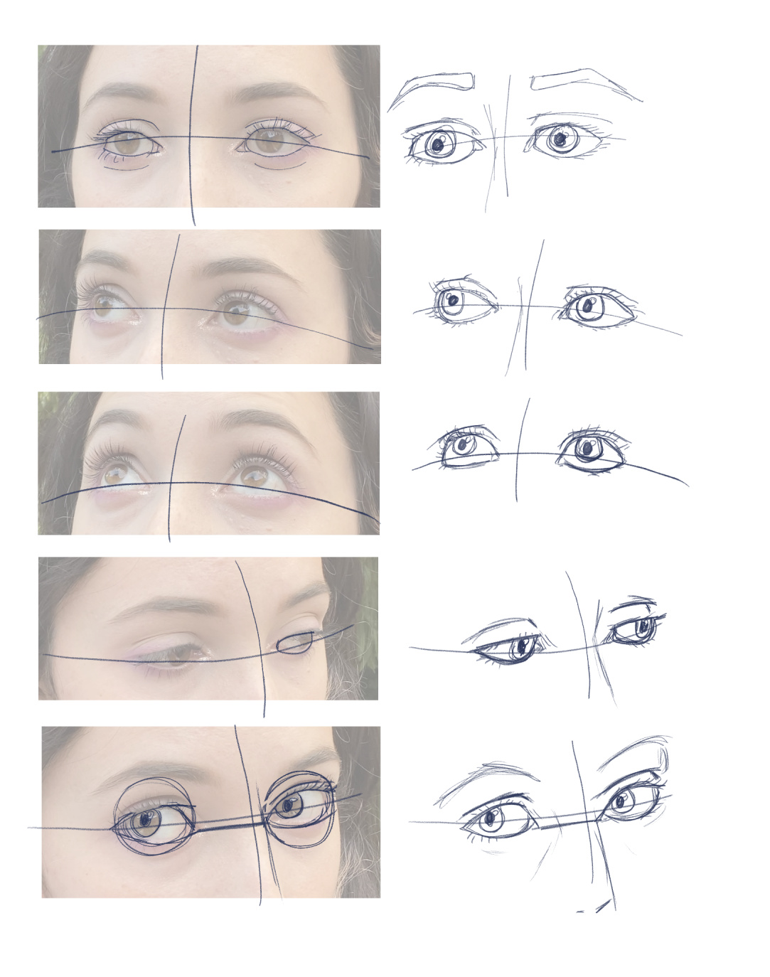
This was an exercise I doubted because I’ve done a lot of practice eyes since I started taking these courses. But this one did make me feel like I spotted a few things that make eyes more expressive with just a few lines. What I'd really like to be able to do is simplify my approach to eyes as I think my big issue is I use too many eyes and then lose details.
Expressions
This program provided a classic expression sheet which was nice to use. I hadn’t planned on doing all three rows because while I worked on it I realised I don’t have characters other than Skil that I draw regularly. Which makes this exercise more difficult.
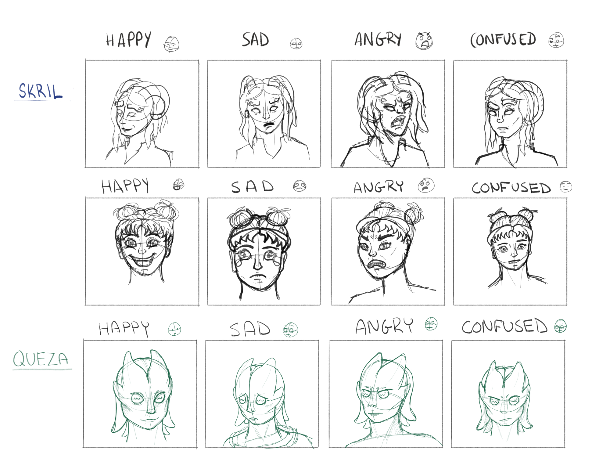
For row two I just wanted to draw someone with hair buns, it’s very clear I have no grasp on that face or character so it’s basic while also being all over the place. For the 3rd row I decided to go with the character from one of my earlier lessons, Queza, who is rather squid-like so I didn’t want to use her at first. But in the end it was nice to play around with a less human face.
Clothing and posing
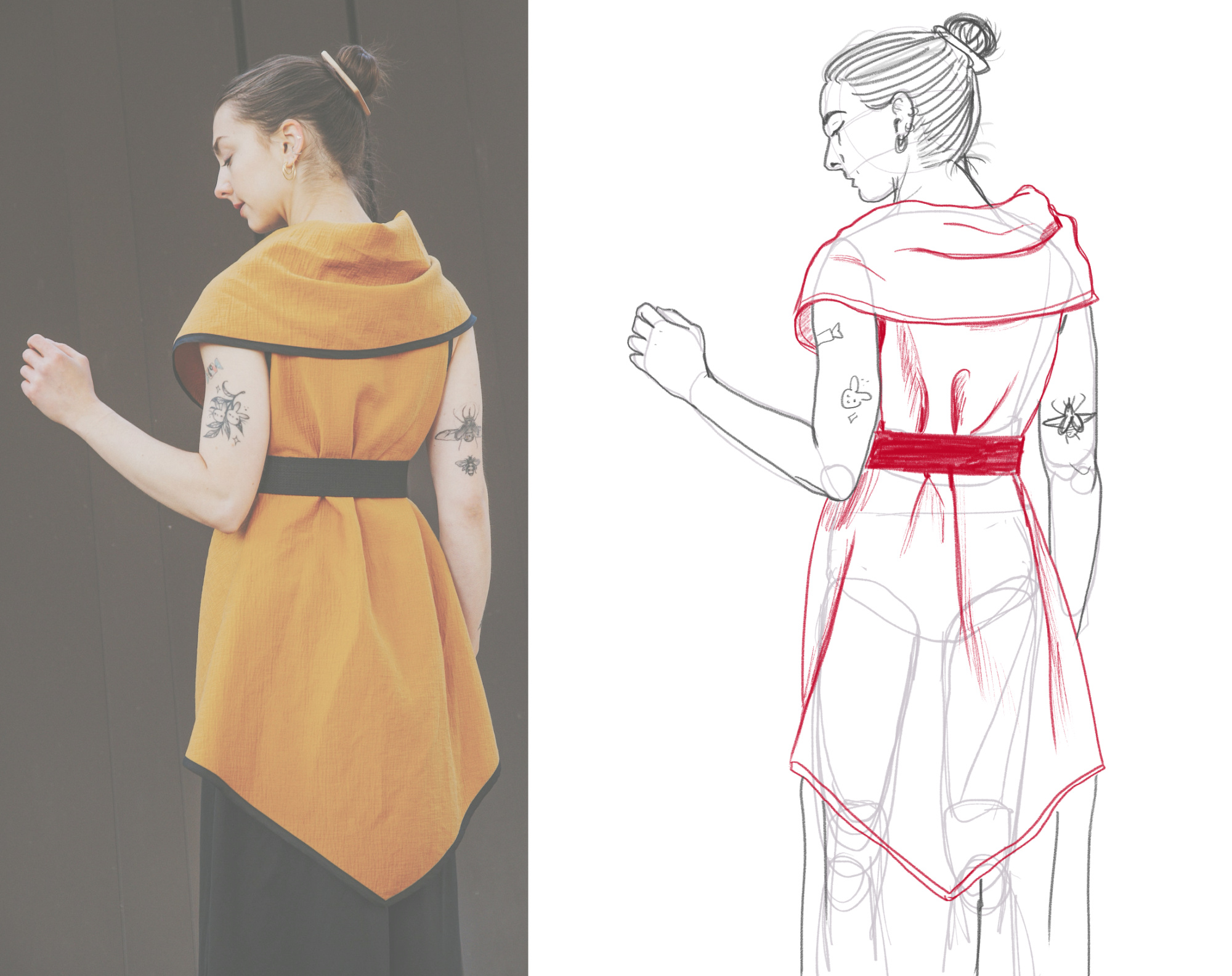
Clothing has always been a weakness of mine, not because of folds and understanding fabric but because I don’t have much creativity for designing outfits. I’ll usually got with simple outfits, not too many layers. Or the classic cheat of; if I’m comfortable with the figure I’ve draw I’ll put them in something fitting, if I’m not comfortable with the proportions/figure I’ll hide the body under something baggier.
For this homework I used an image from Modern Wizard Apparel's Esty shop. I recently ordered a few pieces from there and love them, so you can take this as an endorsement.
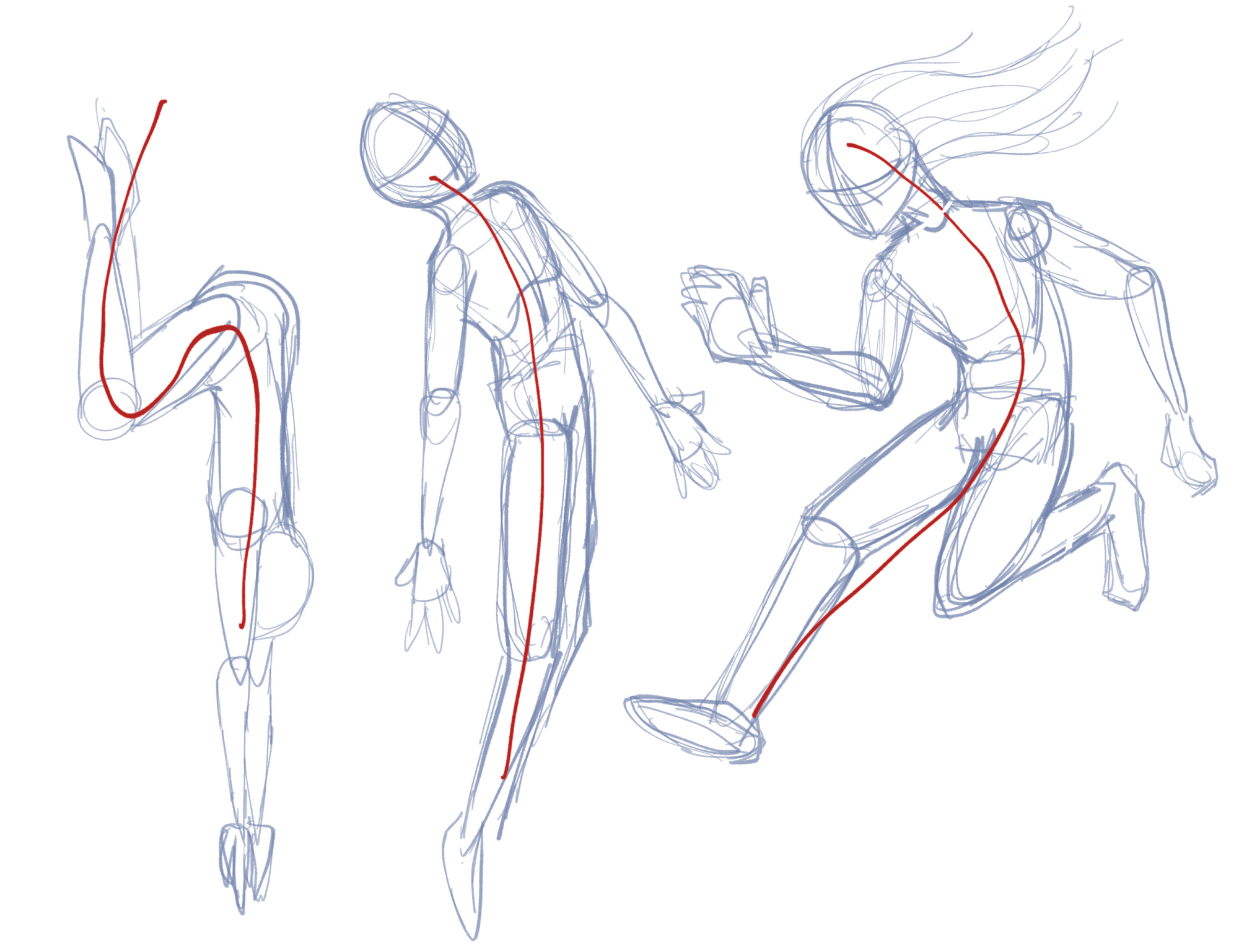
For the posing homework, there was the fun suggestion have having three random curved lines and building a pose around that. I asked my girlfriend to draw three line and then had to deal with a terrifying N-like shape. I struggled with that one for a pretty long time but I’m pretty happy with the dive pose I ended up on.
The project
So one of my biggest weaknesses as a creative is that I’m extremely impatient. One of the reasons I enjoy writing is because I can go really fast and feel good about having just written something down. When it comes to more physical hobbies like drawing or piano, I’m too impatient to:
- Practice
- Take my time when it’s needed
I’m forcing the practice by taking all these courses. Just really trying to let myself be messy with art and try new things. Which is why I often do all the homework assignments. But for point 2, when it comes to “putting something together at the end of the course” I tend to just… not. This is partially because I just want to jump into something new and partially because I know it will take me hours of work to make anything I’m really happy with. And these days I just don’t know where I’ll find hours of free time to put into a larger project.
I did the thumbnailing part of the course, the first step of starting an illustration. Even came up with a few ideas I liked:
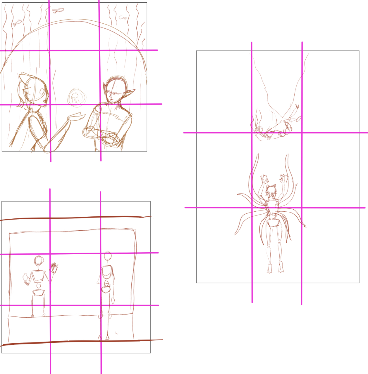
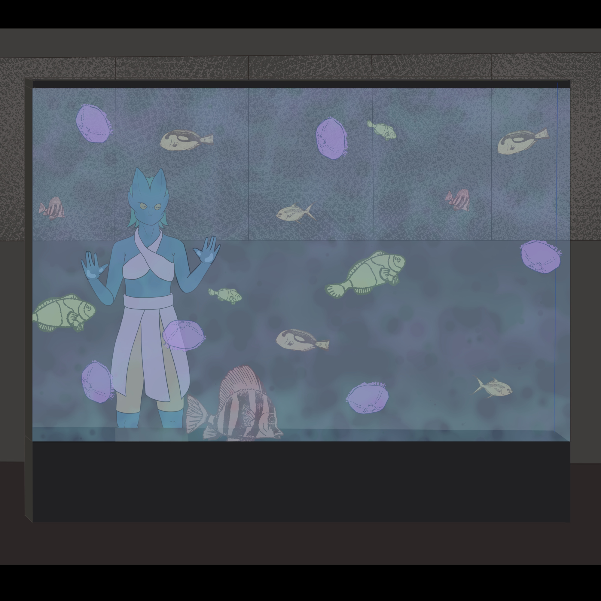
But the thought of having to commit to one just didn’t appeal to me. I put some time into trying to start one of them as a more serious piece, got distracted looking up fish brushes for Clip Studio, didn’t know how to design the 2nd character, and then gave up. A whole illustration just feels a little out of my reach still. Partially because I didn’t find that this course to provided too much in terms of foundational steps or approaches to things like backgrounds or styling. A bit of “and then draw a background”, which isn’t where I’m at yet. This is about as much progress as this piece will ever see:
The illustrations
I gave illustration another shot when I went camping for a few days. This time I wanted to focus more on the steps and not coming up with a scene on my own so I used this image as a reference. There’s a fair bit of photography on these cormorant fishermen which are extremely beautiful. And it's a testament to how terrible the internet is these days that I can't verify who the exact photographer of the image I linked is. A curse I blame Pinterest for. A possible source (and some history behind the fishing practice), can be read about here: Interview: Travel Photographer Highlights China’s Traditional Cormorant Fishing.
This one felt a little promising at the start, felt like I was capturing the pose in the sketch and I liked how the background looked when I just laid down 4 different colours for the major shapes/features. That feeling didn’t last too long once I got into the inking.
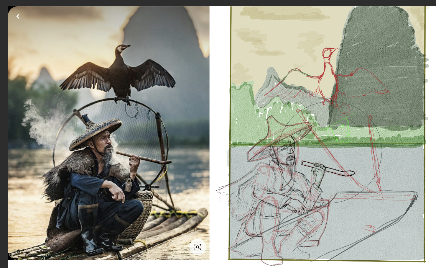
It’s still hard for me to find time to focus on art fully, all I was really getting (on my vacation week!) was 20 minutes when I got into bed. I feel different about it every time I open it up, and have a running list of things I want to improve. But I’m already at the point of “even if I finish this I’m not going to be happy with it” so I’m ready to toss it.
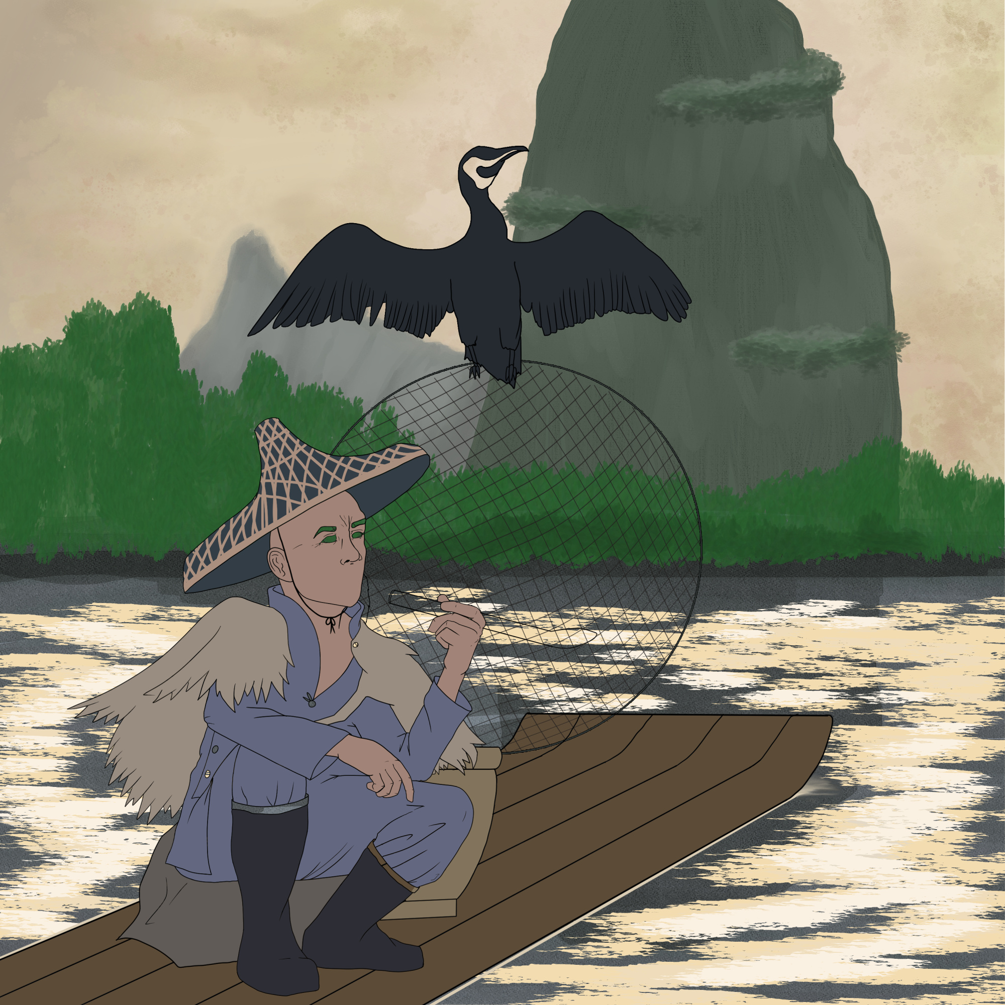
I know pushing through is probably what’s going to help me learn and become more comfortable with larger works but doing full colour, large digital illustrations isn’t really my end goal when it comes to art so I’m less invested in improving in that area right now.
