Storytelling with illustrations
I managed to finished a a course at the start of May before Tears of the Kingdom came out, ‘Telling a Story Through Illustration’.
I was a little intimidated by this course because the idea of doing full illustrations still feels very challenging to me. Make a scene, draw a background, manage areas of focus and lighting. All the parts of drawing in one. Which I feel like I’ll never be ready for!
Thankfully this was another Tony Bancroft course and I’ve come to love his approach and his assignments. As a classically trained animator he’s focused on foundational aspects which is exactly what I still want to focus on.
Frame and composition
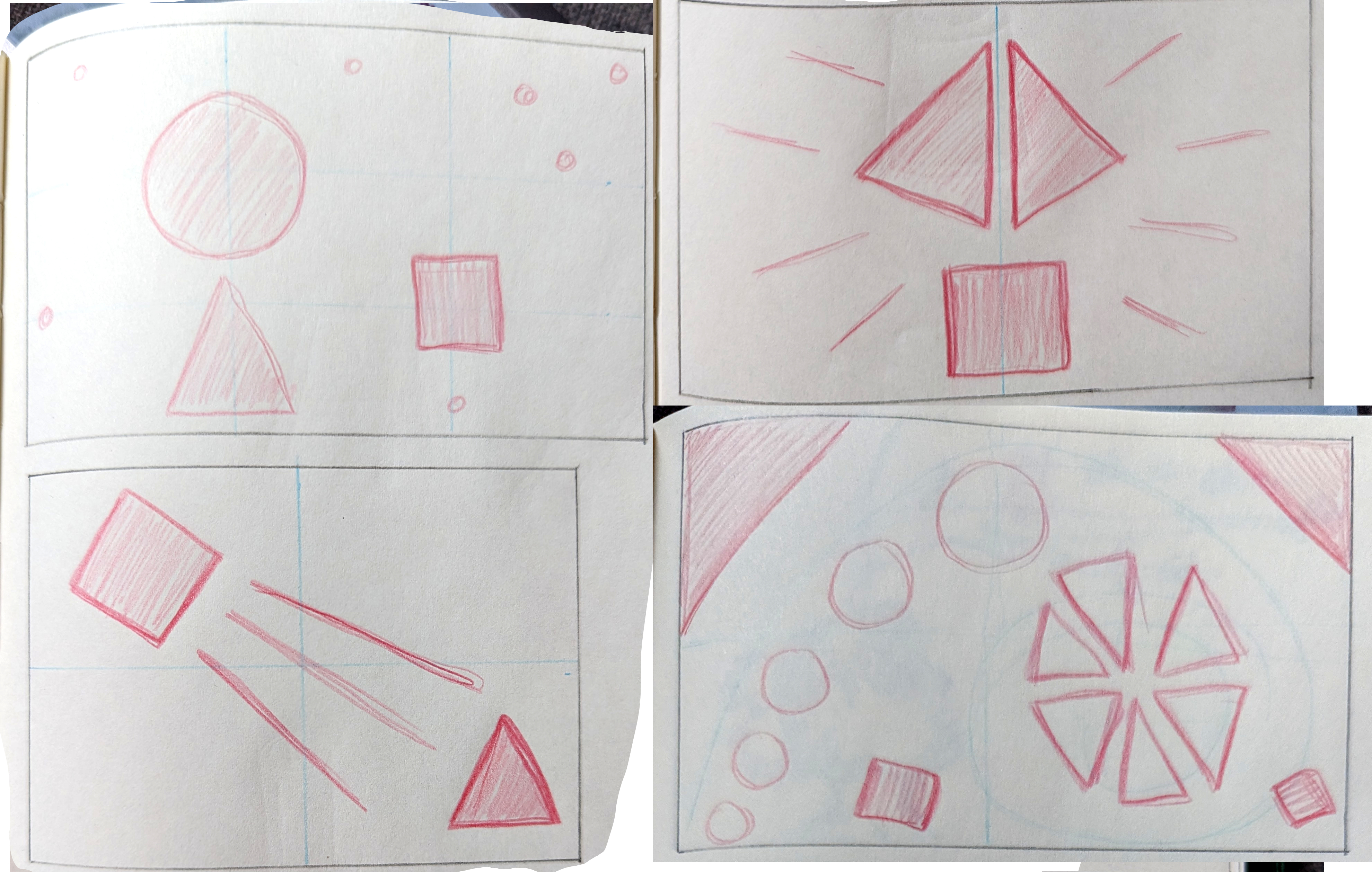
The courses started off by talking about the frame (the area in which your art piece will exist) and composition. In my High School art classes composition was what the art teacher praised me for most. I didn’t really understand what it meant back then, but I now think it means I had a pretty natural grasp of the use of space. This section had the mini assignment of creating different kinds of traditional compositions using only basic shapes.
Horizon lines and your point of view
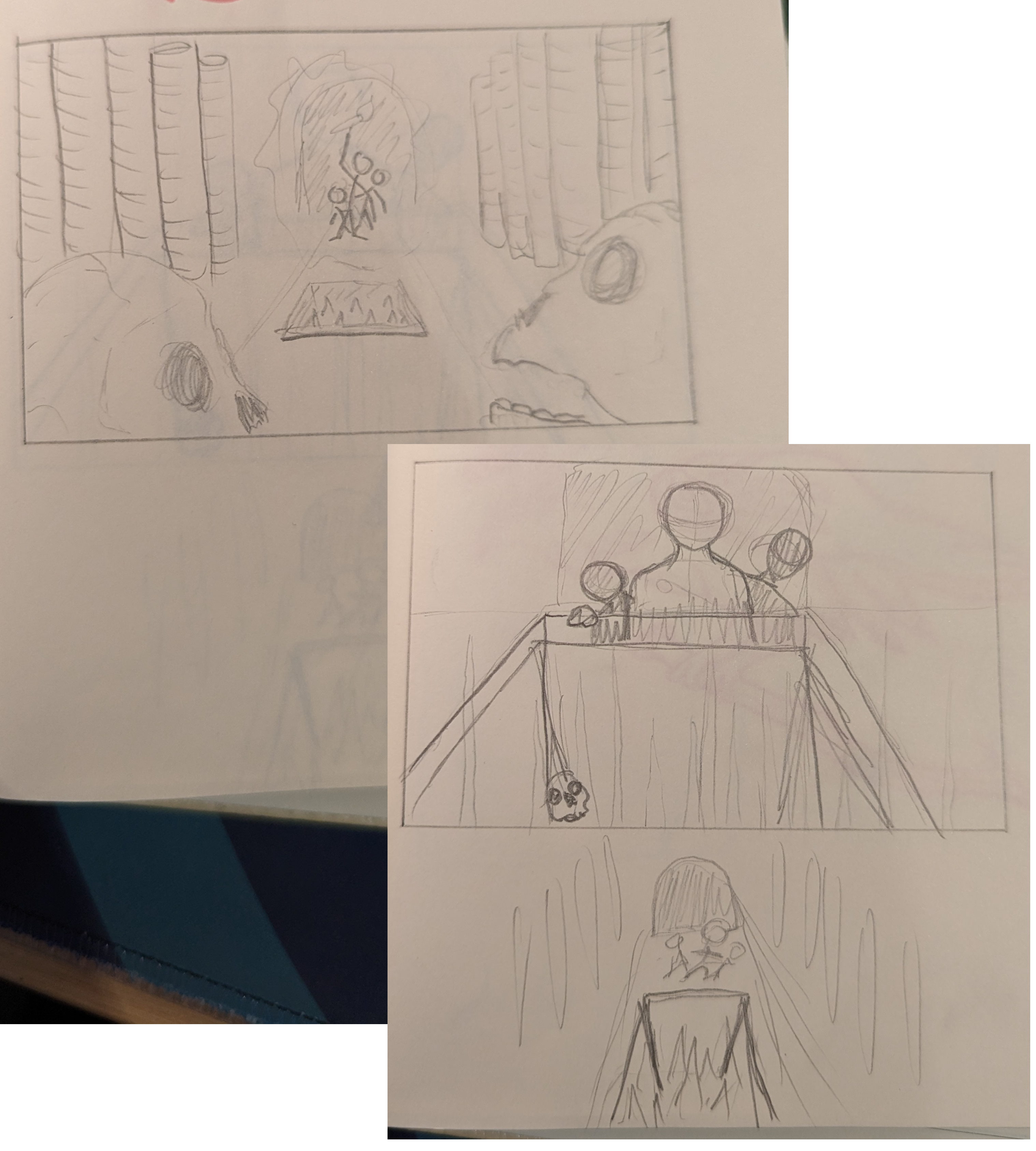
The next section covered different ways to layout a scene. Horizon lines are that line in an image that’s usually the split between the ground and the sky. Tony shared examples on how different horizon line placements can dramatically change what’s in focus in the scene or how they can be used to shift perspective.
In my two practice runs I tried a very high horizon line to have more space to work with a landscape. While in the second I tried a low and angled horizon line to show the size differences between the mouse and the cat while trying to create more dynamics with a tilted line.

The other assignment for this section was to Push You Point of View. Which means to move away from a flat scene where everything might have equal prominence to one that creates more depth by using a different point of view. The challenge provided was to draw a young girl looking up at a bird singing in a tree.
- Low POV looking up at the bird
- High POV from the bird angled down
- Flat POV where neither is in more focus
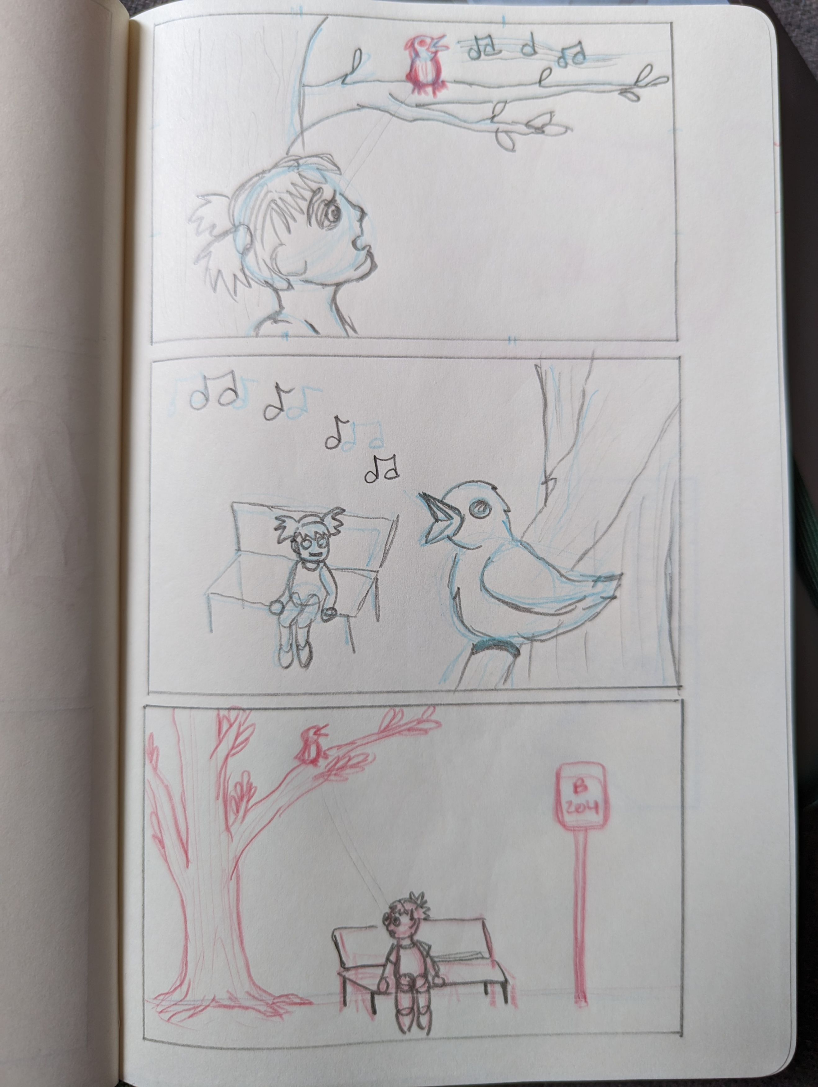
I really liked this as an exercise as I rarely push for different angles in my pieces but these quick sketches very easily show that the first two images are way more interesting composition wise than the last one.
Depth, lines, overlap
The rest of the course covered a few more tricks for creating a good composition.
Depth: Work with foreground, middle, and background Lines of action: Use the lines of everything in the scene to point towards your focus area Overlap: Overlap objects to create more depth and a more natural look
My first attempt at a scene using these tips, followed by pushing it with an up angle and down angle approach:
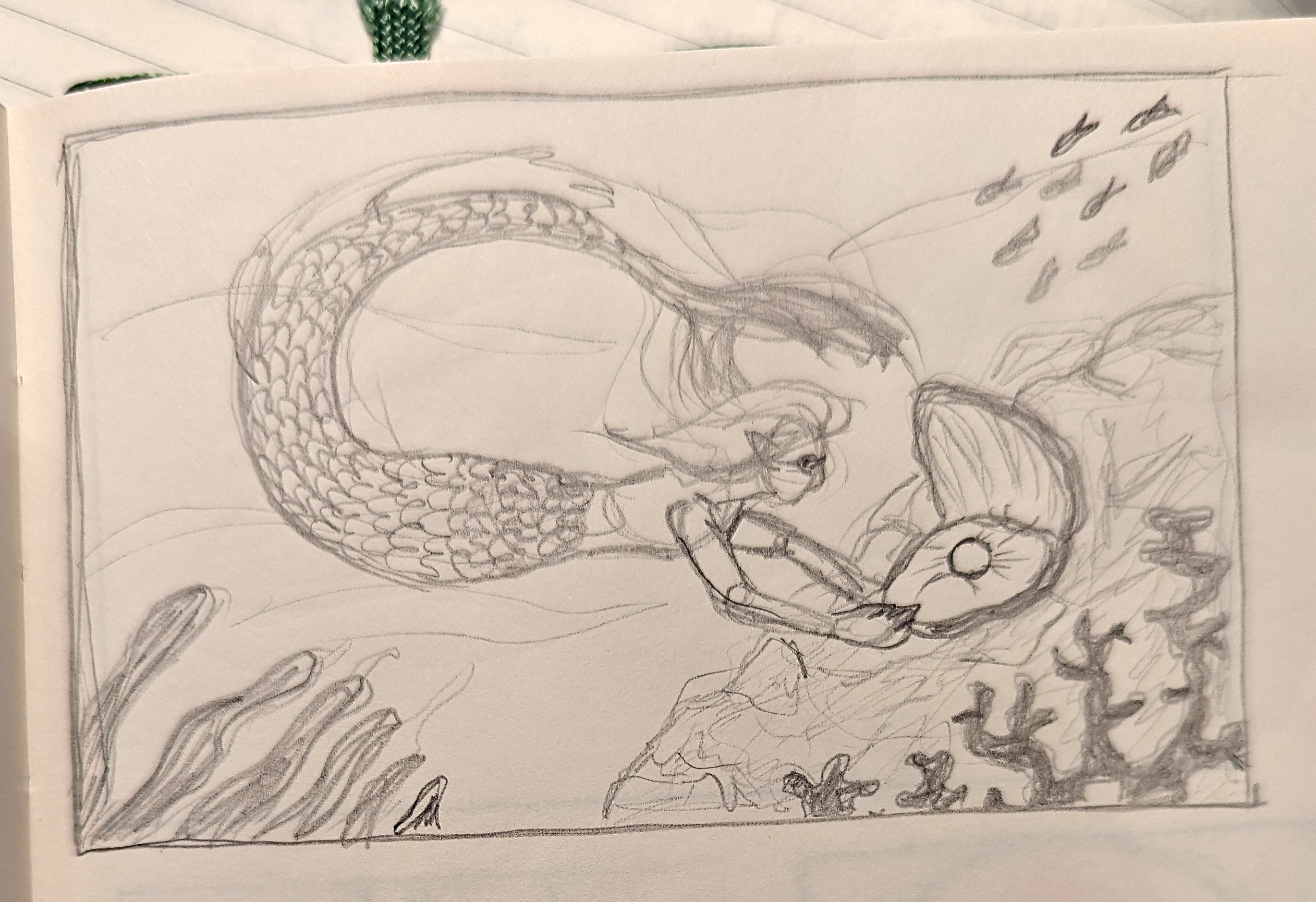
And then a new piece to try to capture all the different parts of the course. I maybe only managed to get in directional lines and different depth levels. Directional lines were my main focus as I didn’t use them as much in previous home works. And I find all the final “now put it all together and draw something” assignments to easily feel overwhelming, it’s difficult to think of something that feels like all the rules can be used. But the pros make it all look easy to bring the pieces together so I know it’s possible, but my brain doesn’t think in those processes just yet.
Next course
I complained about the creature design course last time, but forgot to share that I did do the first assignment from it: drawing the skeletal and muscular structure of a creature.
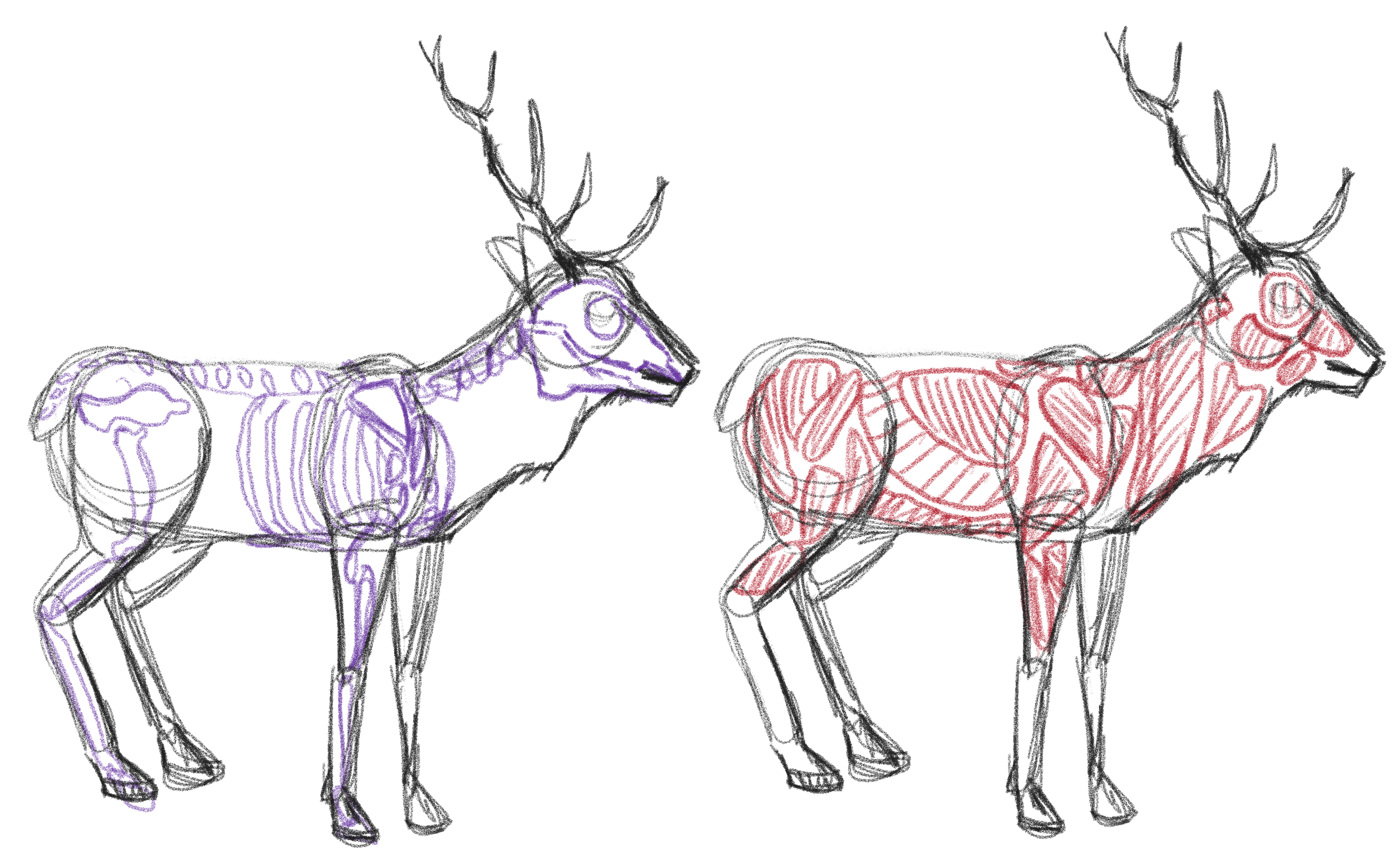
This was kind of fun and I can see it being helpful for doing more serious creature design. There’s lots of different animal anatomy out there to learn! But instead I’m going on to the ‘Designing Fun Animal Characters’ course to instead learn the much more simplified approach to creatures.
