Learning Light
After getting through a large portion of the beginner level courses on 21 Draw, I finally felt like I could start dipping into the intermediate level courses. Starting with Aveline Stokart’s ‘Mastering Lighting and Shading’.
This is one of 21 Draws top highlighted courses, a large portion of it is even available for free on YouTube. Now that I’ve completed the whole thing it definitely deserves the top slot on the website and I would highly recommend it for anyone who wants to get more creative with lighting in their illustrations.
It starts by walking you through the basics of light and shadows on simple shapes. I always forget the specific names for different types of light and shadows so this was good for me, even if I’ve forgotten half of the names already. Then we did some studies of movie scenes to grasp light in action and after that Aveline provides a sketch that you then use to create 4 different lighting scenarios which is where the real takeaways come from.
Learning to see light
One of the exercises that Aveline gives is to study movie shots. This has come up before in other courses for studying composition and colours, but her approach was all about understanding how light was being used in the scene. Be it to highlight something specific in the scene to draw the eye or set the tone.
I chose this Black Swan shot for my study because I wanted something simple to get through the exercises quickly.
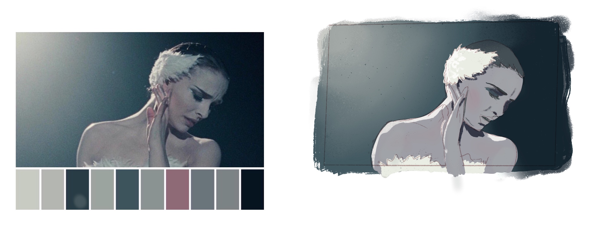
I don’t like it when I look at it in full size as the colours are all off, but every time I see this in thumbnail form on the Procreate project selection screen it looks pretty good!
The base
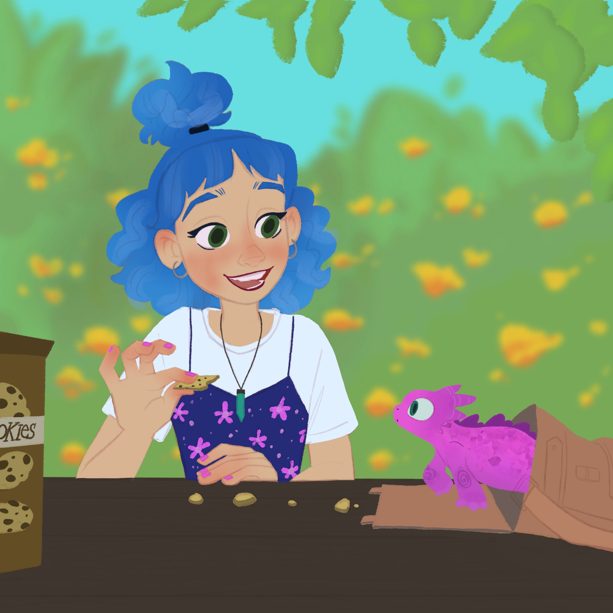
The base sketch is a girl with a small dragon. We filled in the flats, gave it a simple background and filled in some details like the cookie box and her shirt.
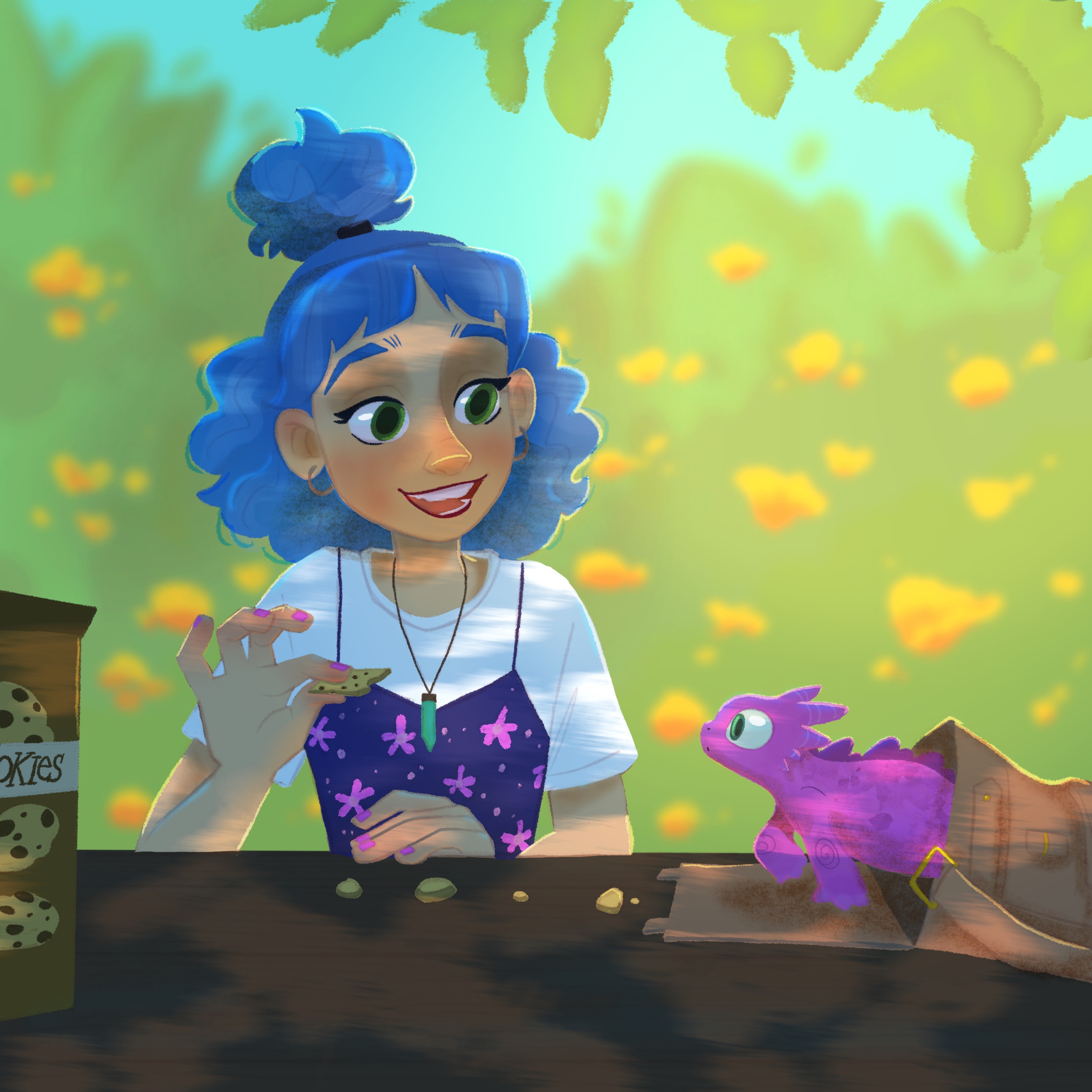
Scenario 1: Sunny day
The first lighting scenario was a bright sunny day with the light coming through between the tree branches. It was in this first explainer video that I learned how many layers it takes to do light well. I think Aveline used over 10 different layers to pull off this look. That’s layers for bounce light, ambient light, specular light, general highlights, and on and on.
I’d never worked with Mask layers before so this was an interesting one to see right from the start. And makes a lot of sense given a lesson I picked up from a different course: Lighting is more about erasing than painting. You carve out the areas being hit by light. I’ve done that in the past to create minor vignette effects but to see it used to create the main light regions in an illustration was something else!
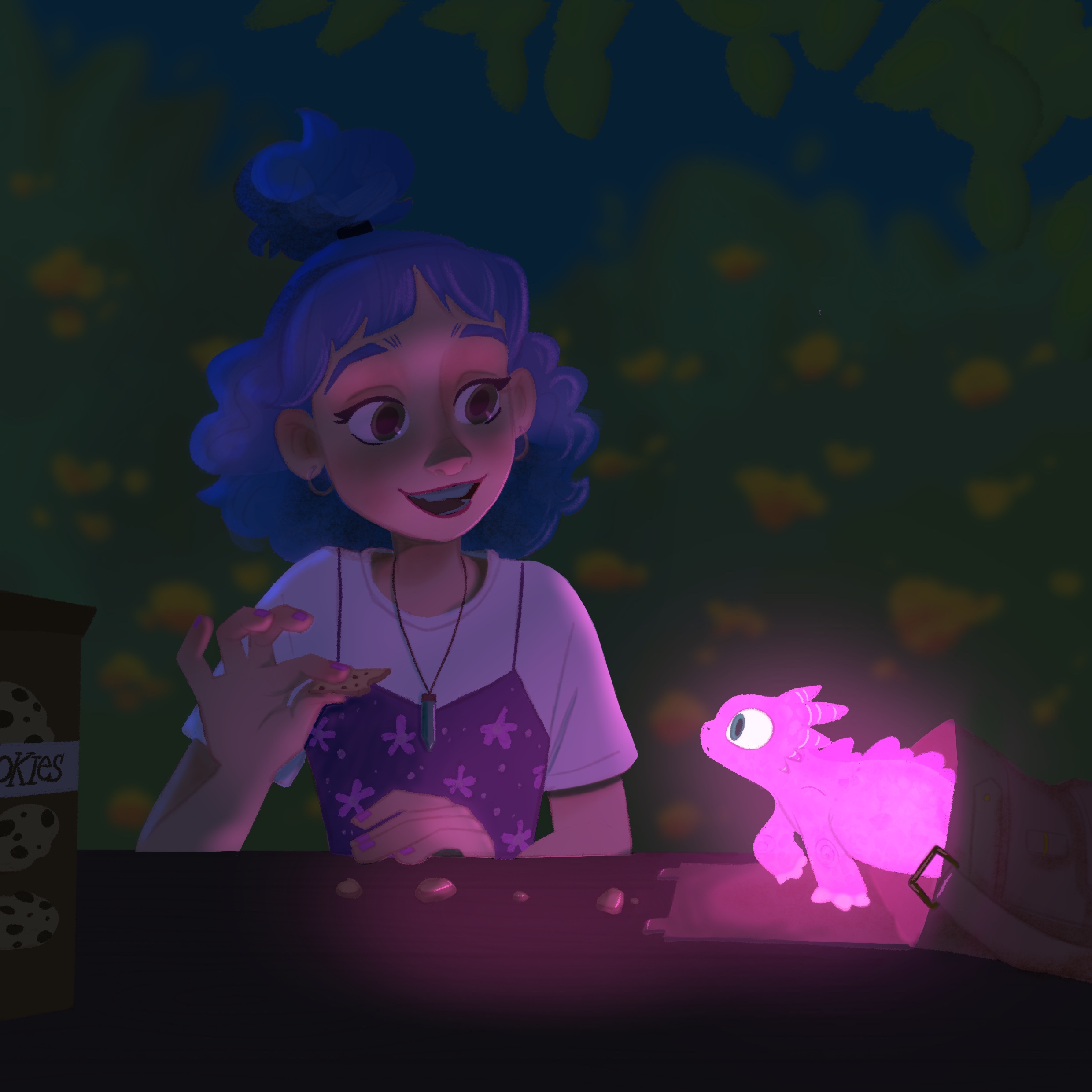
Scenario 2: Night - Glow
In the second challenge the bright day is completely flipped for a dark night. The lighting layers are all deleted, we keep the base colours around, and start again.
I generally find glows really fun to work with in digital art. There are lots of options to play with and room for experimentation. In this scene it’s the little dragon giving off the glow so we have the direction of the light change from the first scene. The light is also more tinted then the light of the sun so the whole scene feels drastically shifted away from the vibrant day.
Scenario 3: Indoors - Overcast
For scenes 3 and 4 we’ve moved inside. So quickly through a new background together; walls and some hanging art.
Same approach, delete all the previous lighting layers, choose a new ambient base colour and start adding layers. I think I went a little too dark on this one, it’s pretty easy to over shoot a colour and a good opacity level.
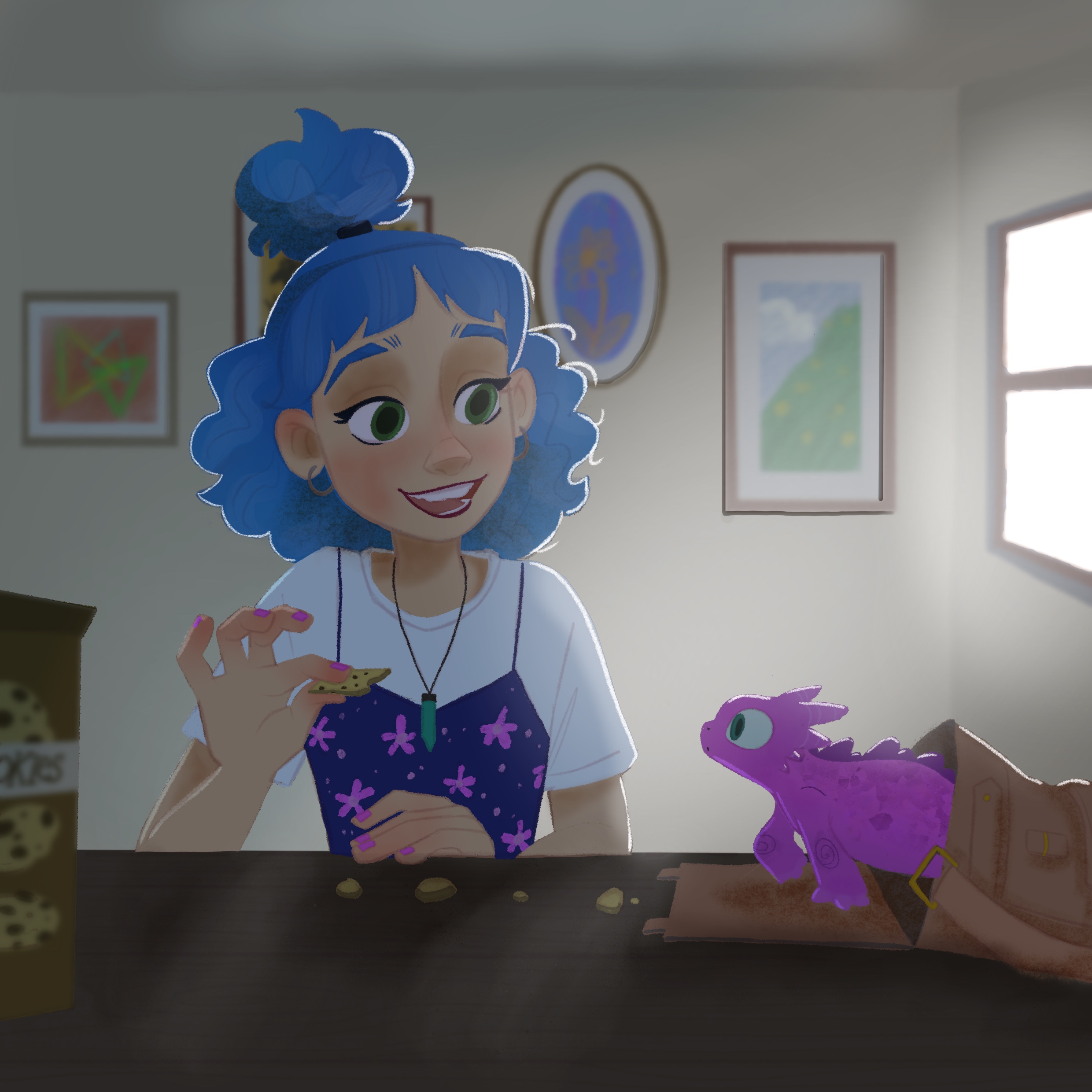
Scenario 4: Indoors - Sunset
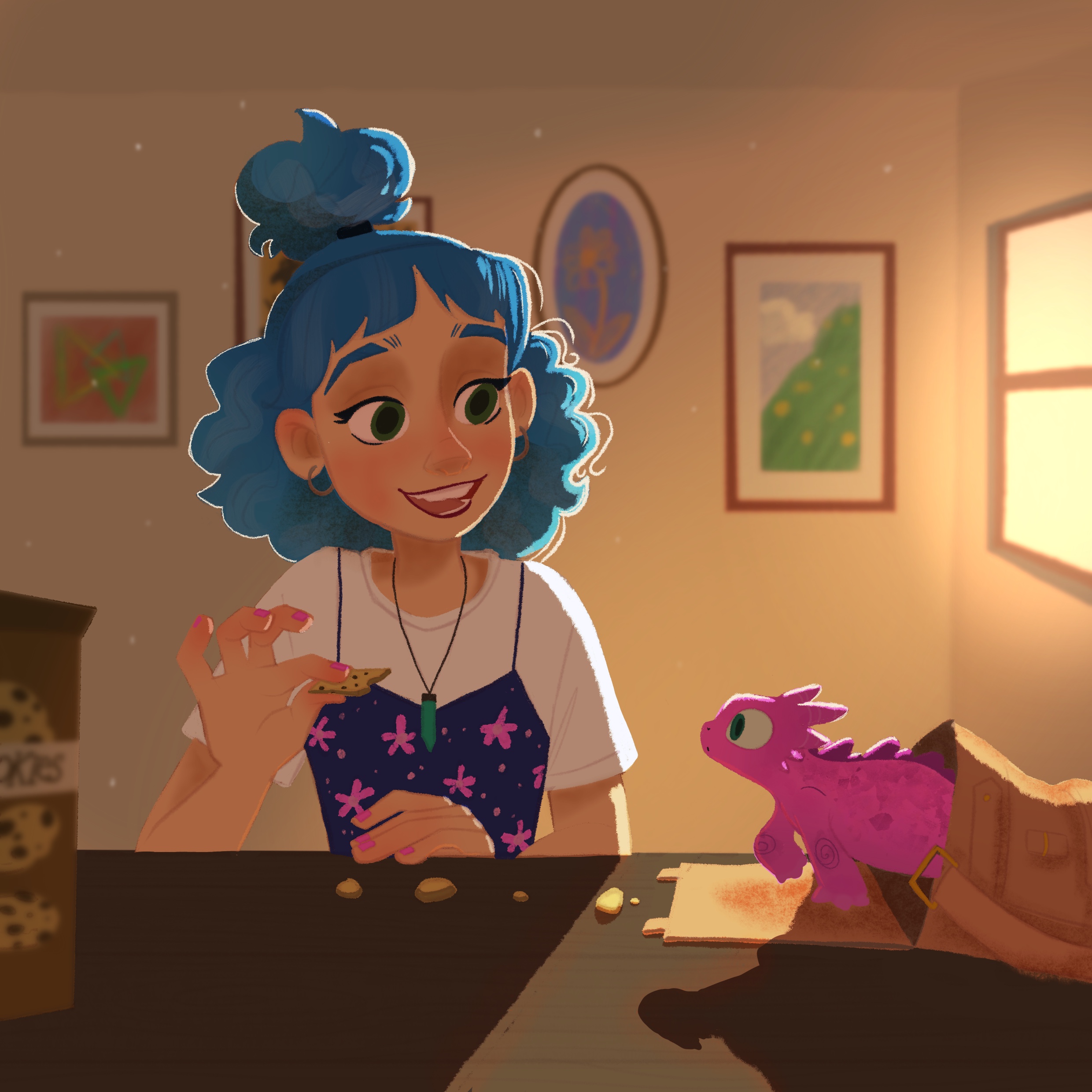
Now going to warm colours for a sunset vibe that’s much more intense then the overcast day in the previous one. Both of these scenarios moved to a more backlit character and I may have lost details in the girl's face. One of the other important tips, which I still struggled to execute, is when it’s okay to cheat.
You can live by the realistic movements of light and shadows but if you want to balance your piece and have the important parts pop, it’s good to “cheat” by adding highlights to locations that need it to stand out. You still follow the rules of the scene, where the lights are coming from, colour, etc. But if it means putting a bit of highlight on a dark face to make a face more visible, it’s usually the right call.
Conclusion
Before this course I didn’t think about light too much. I always have a mental map of where light is coming from when shading a character and thought was enough. And sure it was fine for rather flat character work, but going through all the steps to add even baseline lighting to these scenes has reinforced how much heavy lifting lighting does to create a scene and vibe. I feel less afraid to tackle a whole illustration now, and maybe take a few more daring approaches to lighting characters in the future.

