Art - 2025 review
· 8 min read

Looking back at my final art blog post in 2024 I want to laugh. Not at what I was wrapping up, but where I laid out the goals for my art practice of 2025.
I acknowledged that we were going to start 2025 with a game jam and that would be my art for January. But little did I know that that game jam would completely change the direction the year would take.
January
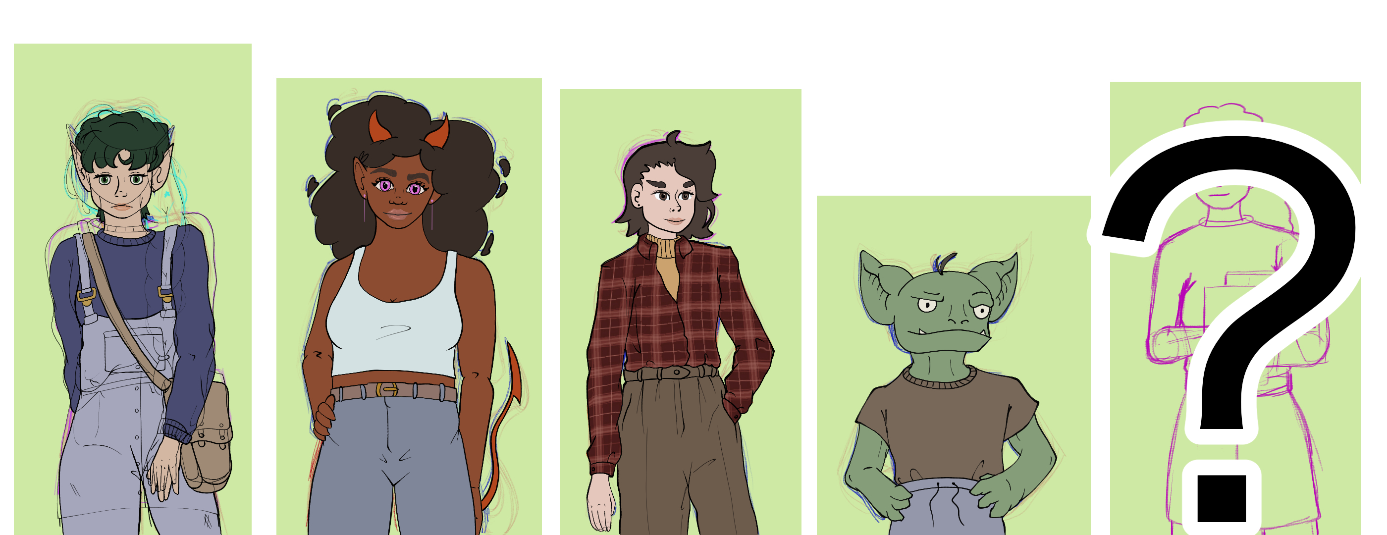
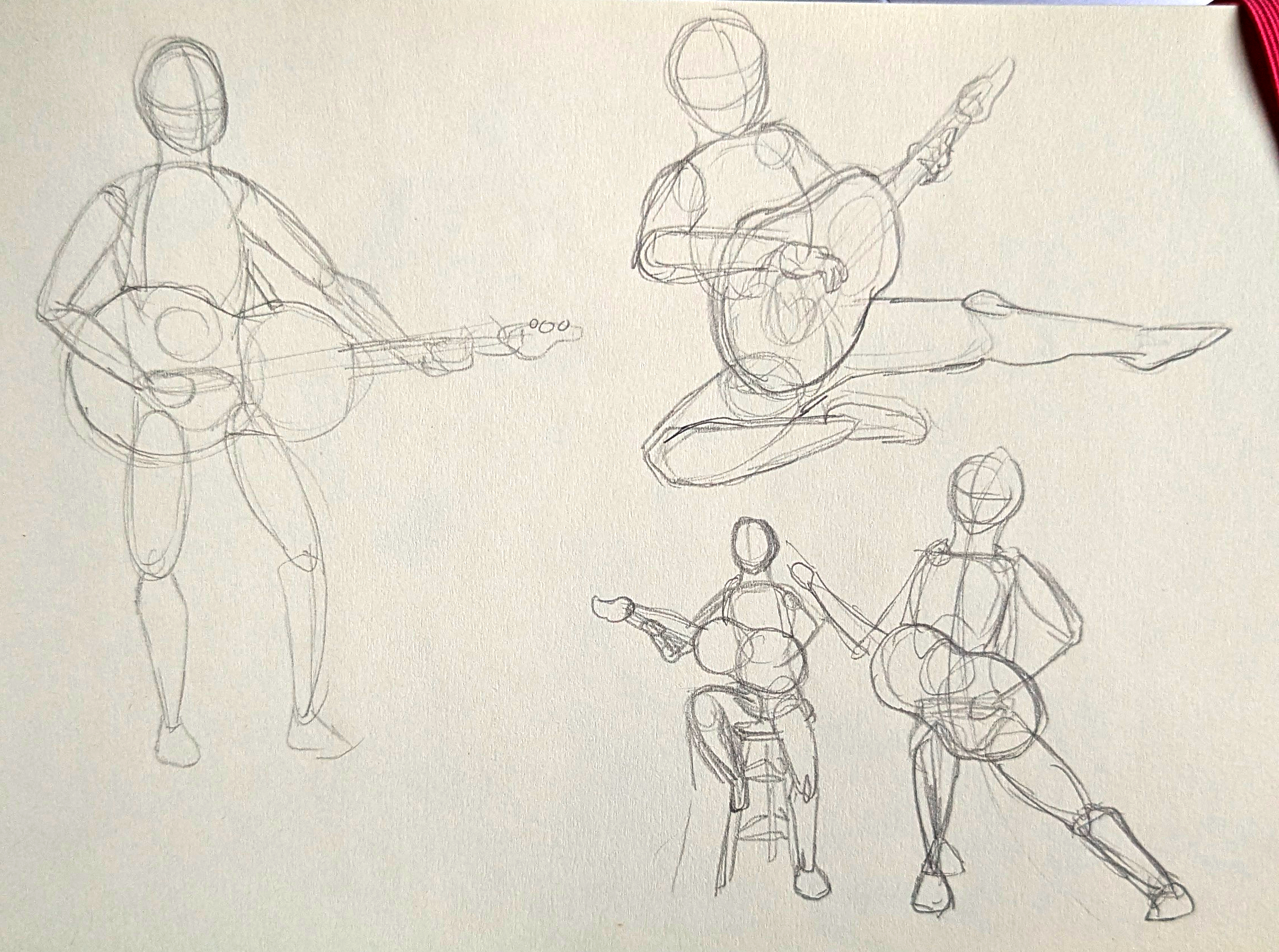
January was full focus on Love in the Time of Spellphage. There were characters, there were backgrounds, there were random other assets needed to just add a little more flare. I covered most of these in my DevLog posts last year.