Learning landscapes
While this is one of the most popular courses on 21 Draw I didn’t prioritise it. My interests had always been more around character design and creatures. But after branching out in a few other courses, I thought it would be time to keep trying to step out of my comfort zone.
This course is taught by Philip Sue and it looks like he has a lot of step by step process videos on his YouTube which likely cover a lot of the things covered in this course.
Greyscales
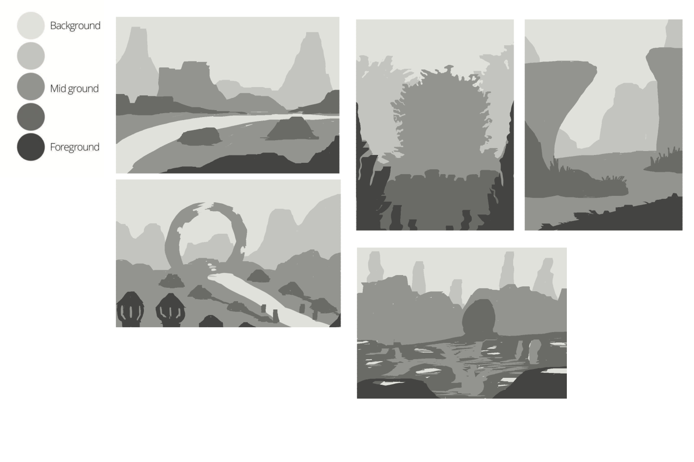
Just like in a lot of the other courses I’ve taken so far, this one started out with silhouettes. It was a pretty free form first exercise, work with the 5 tones to compose a background, midground, and foreground. The assignment pushed you to make five different pieces which was a good stretch and quickly where I started to diverge a little too much from the guidelines.

My first few landscapes felt reasonable, but then I started to get ideas for D&D game locations. These started off problematic as I was too “zoomed in” to follow lots of the advice that was being provided for landscapes. They could probably work as general illustrations but there wasn’t enough distance between the features to really follow the next steps. Which is what pushed me to continue with only 2 pieces instead of 3 like the course suggested.
Colours
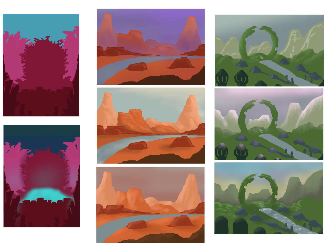
THe courses provided some palettes to try out but I didn’t want to screenshot the video and then pull the colours into Clip Studio so I looked up some other palettes on Pinterest. These weren’t as curated so it was actually more time confusing and not super rewarding. The orange, desert-y one was from the instructor while my green ring ended up being mostly eye balled. But I was at least happy to have 2 very different colourscapes to work with.

There was a step for experimenting with colours and lighting, and I would have loved to have access to Procreate's Gradient Maps for that, but in Clip I played around with colours layers and some manual re-painting. I had always thought I had a pretty good natural grasp of lighting but on trying to get more creative with it in these scenes I started to question that. Good thing there’s a whole class on lighting that I can still take.
Detailing
After composition and colours comes making the thumbnail huge and getting into the details.
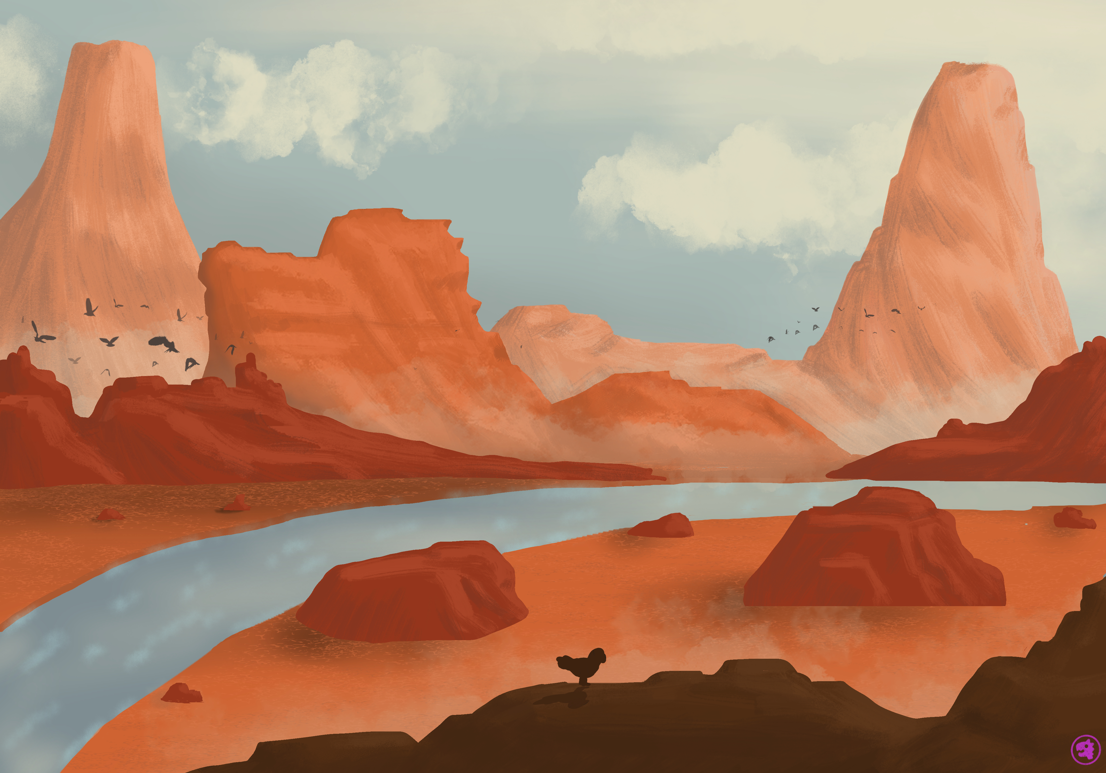
The first one, my desert, thankfully doesn’t have many details going on. Touched up the lighting, added some extra rocks and made a very simple stream. I probably spent just as much time looking for nice cloud brushes. It definitely took a while to get used to the movements of painting and erasing over and over again to try to create the right shapes in the mountains, and I still don’t feel like I nailed that, but I feel like I’m getting closer at least. I re-painted a few of them a few times, trying out different brushes and techniques. Most of them ended up smoothing things out too much and losing the rock-like texture of large sweeping strokes. Which feels like the largest challenge of painting like this, you kind of want to work minimally as more strokes or colours ends up washing out the sharp lines and features.

I’m pretty happy with how this came out in the end. There are definitely areas I can see improvements for already, but it feels “big” which is what I wanted to learn to do in this course.
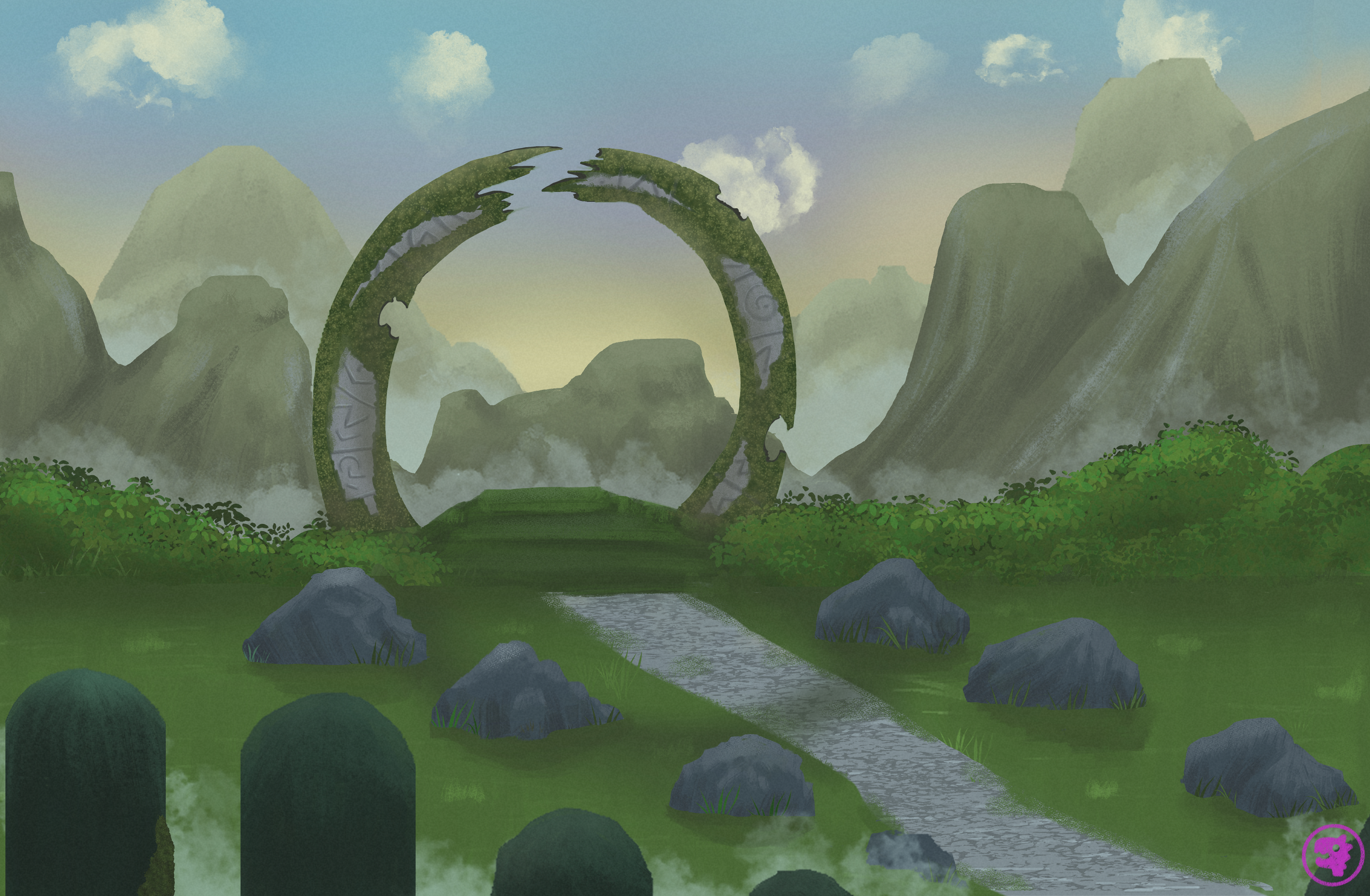
For my green pieces I felt like I had fallen into my “too zoomed in” habit here a bit too. I ended up spending a lot of time on detailing the big stone ring, and adding plant textures with plant brushes. All the while I should have been working further out to a point of not seeing any of these details.

I also struggled with the colour balance a bit more here. I wanted the sun to be rising behind the mountains which made for minimal light hitting the side we could actually see. And some of the mountains felt like they started to disappear, which I guess makes sense if the light is so bright behind them, but I ended up darkening up a lot of features so that the lines between layers of distance still made sense.
Final review
Overall I found this course had the perfect balance of lesson + homework. It had some great foundational takeaways and you could instantly apply what was being taught. I struggled a little bit with the program being Photoshop in the course, but nearly all the features also exist in Clip Studio so it was just a matter of figuring out the right tool or button to accomplish the task. The course managed to really break down how to approach landscapes and now I no longer feel intimidated by them. Will definitely draw more in the future.
