Weekly Art Practice - Week 34
This week’s practice was a style/master study of Ken Sugimori, the original Pokemon artist, known for drawing all original 151 Pokemon.
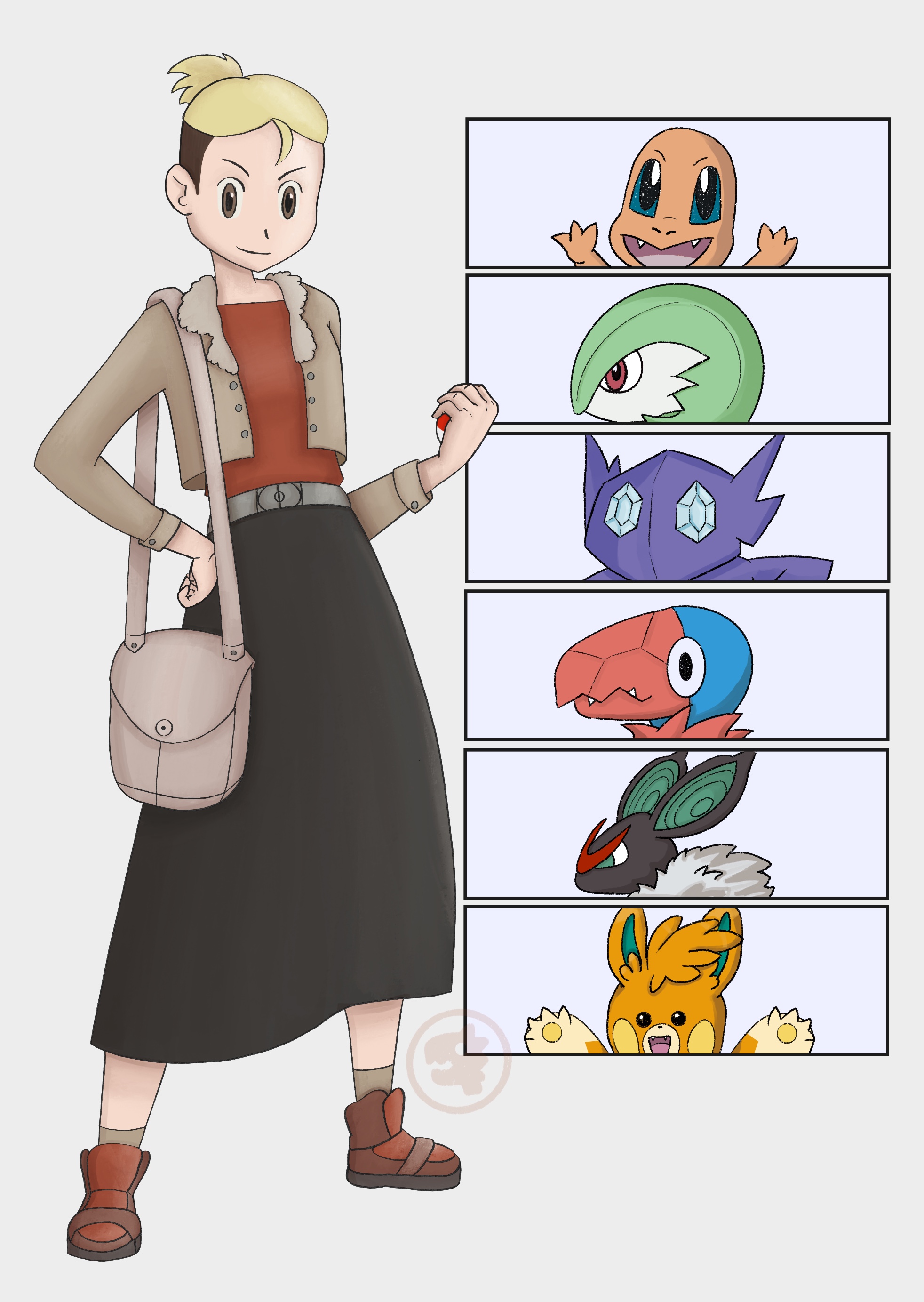
I didn’t want to draw just Pokemon, instead leaning on my learnings from anatomy practice and my goal of a self-portrait, I wanted to make myself into a Pokemon trainer. I did a fair bit of YouTube research for this one and I’ll share the resources that were most helpful or insightful throughout the blog post.
Step 1 - Pose
Following the workflow learn from character design week, step one was to focus on the pose only. Starting from Pinterest I gathered up a bunch of references of original Pokemon trainer artwork as well as a few modern interpretations.
I tried out a few poses, 2 from game references and one that just felt like it really fit the aggressive trainer look.
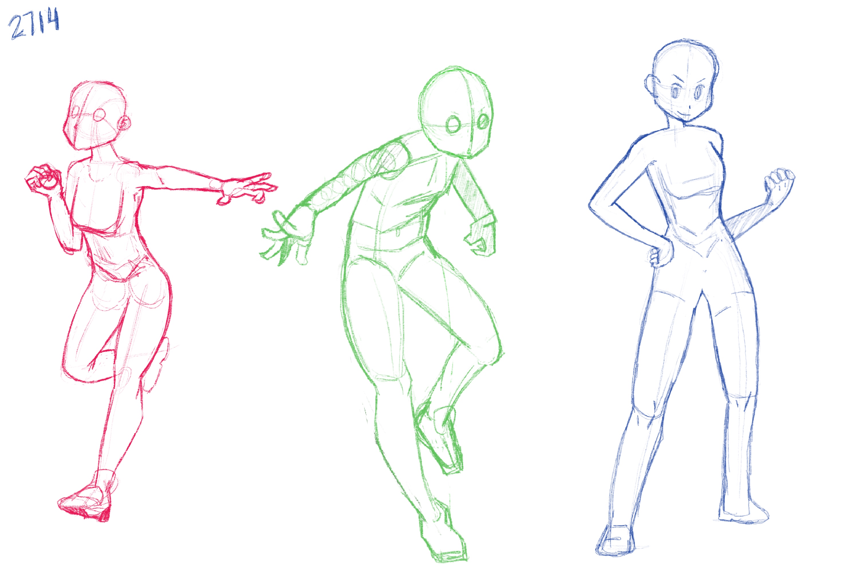
I didn’t deviate too much from the original poses, wanting this week to be more about design and technique than anatomy or dynamic posing. For proportions, faces, and general shape design, Rjamez Valdez 4 piece trainer tutorial is absolutely excellent. This is someone who has spent a lot of time studying the originals and also drawing trainers. He breaks down each feature to make it seem easy.
Step 2 - Design
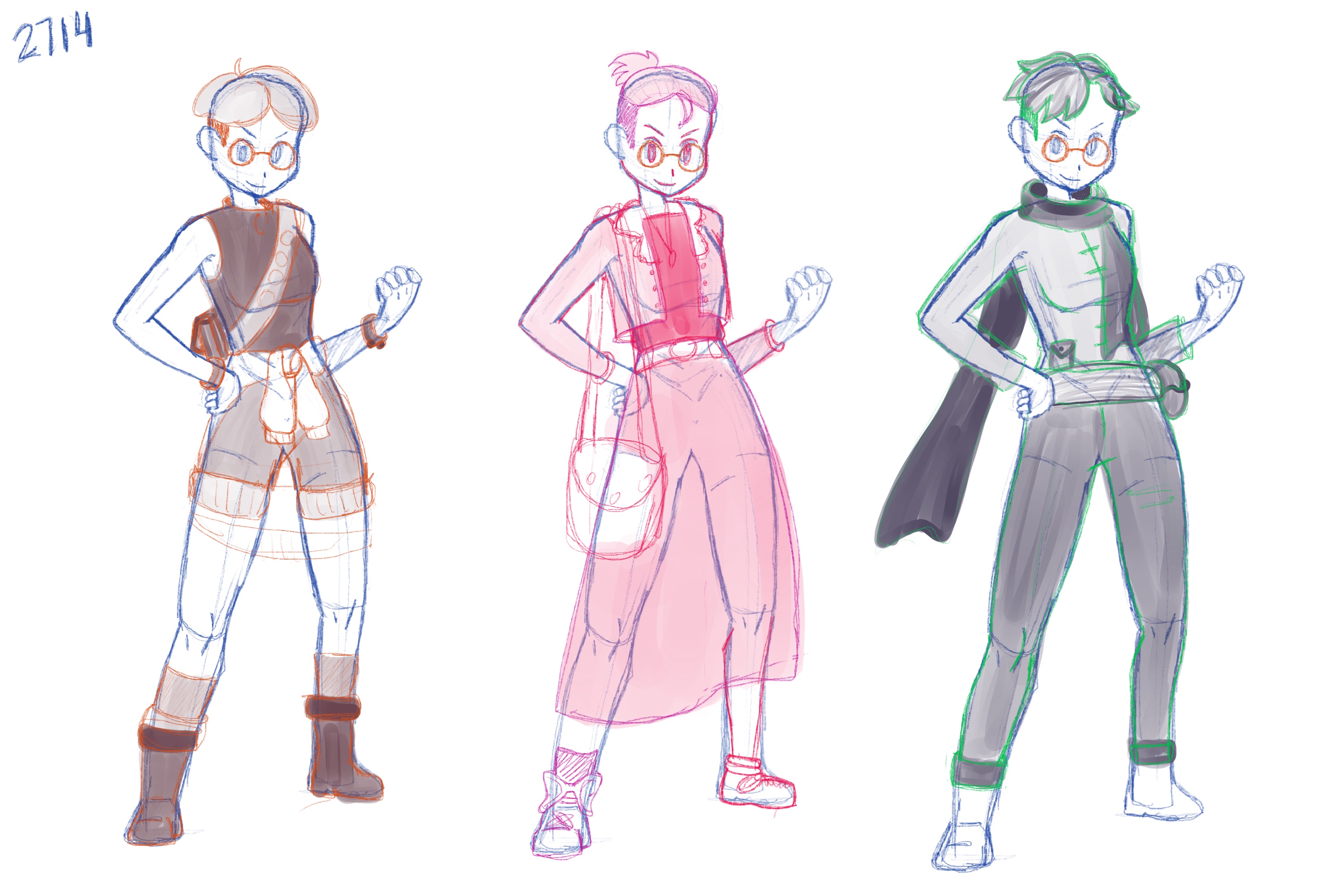
Design is one of my weaknesses but I feel like by doing 3 mandatory base sketches I’m finally starting to find ways to work around my weaknesses. I definitely used to just do 1 sketch and run with it, but now, for a lot of my work, I try to force at least 3 iterations to either get out of my comfort zone or increase the appeal of the original sketch.
Step 3 - Lines & Colours
So I messed up the process already. I should have forced myself to stay in step one longer because I really wasn’t happy with the hands. But the problem was that I had done them to match the reference image but then when looking at them again and trying out the hand pose in real life, it just didn’t make sense. So I ended up doing half the lines and then having to pause to re-work both hands over and over again. Even had my wife take a photo of my hand in the pose I wanted so I could use it as a visual reference.
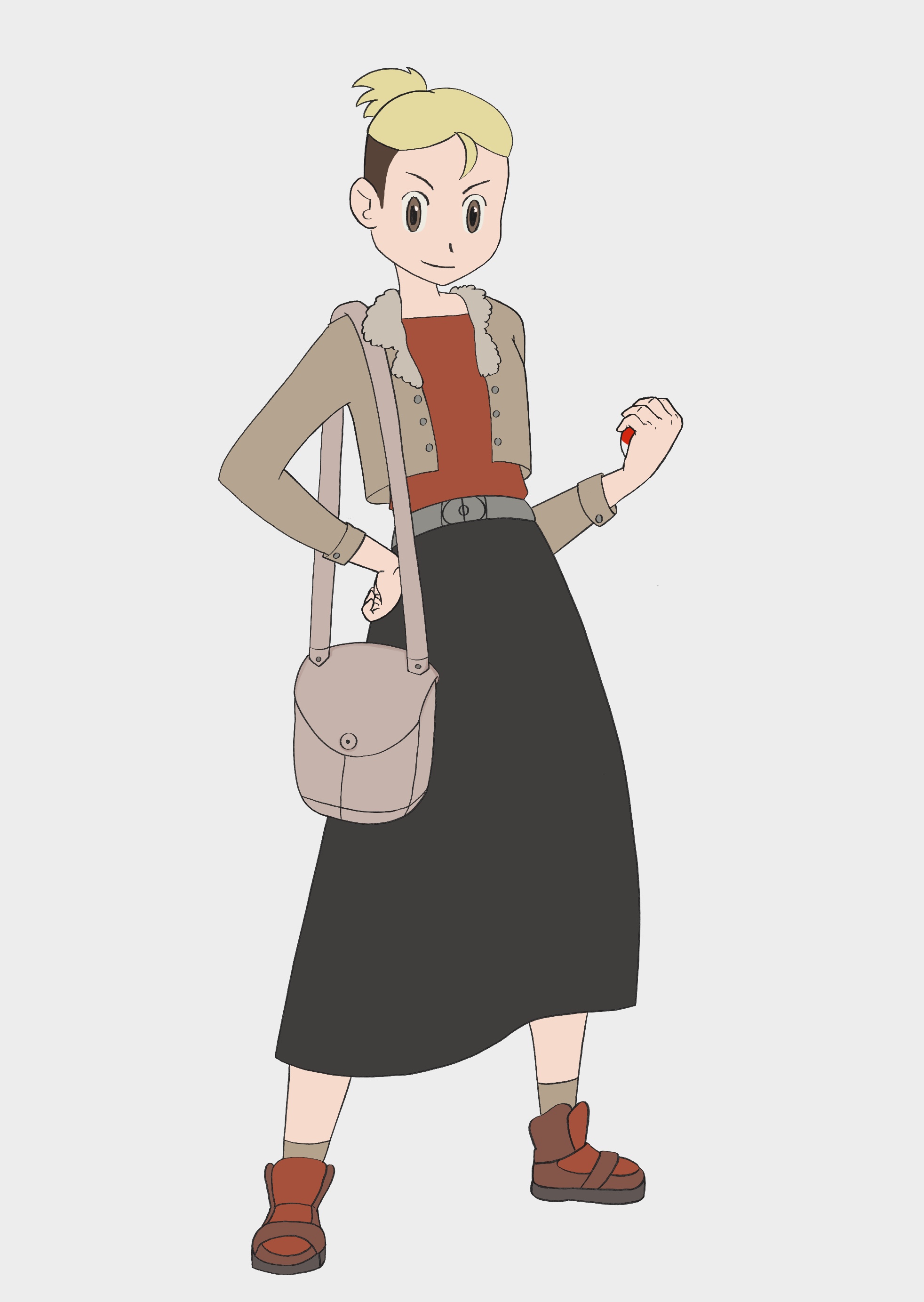
Once I finally had the lines done I generated a colour palette from an image of mainline Pokemon trainers of the last 15-ish years. The palette of Pokemon art is rather specific so I didn’t want to choose colours on my own. They’re a combo of being rather muted with a few instances of strong saturation. I struggle with that balance so I tried to stay on the muted end of things. Which led to more beige than I really wanted…
Step 4 - Rendering
Pokemon art has a very soft watercolour look to it. Where the original game work might have been done completely traditionally with water colours. Which makes for a challenge to duplicate digitally. But many have tried and I’ll share their experiences in the conclusion. I didn’t have to do too much experimenting as I was able to take other people’s brush recommendations and run with it.
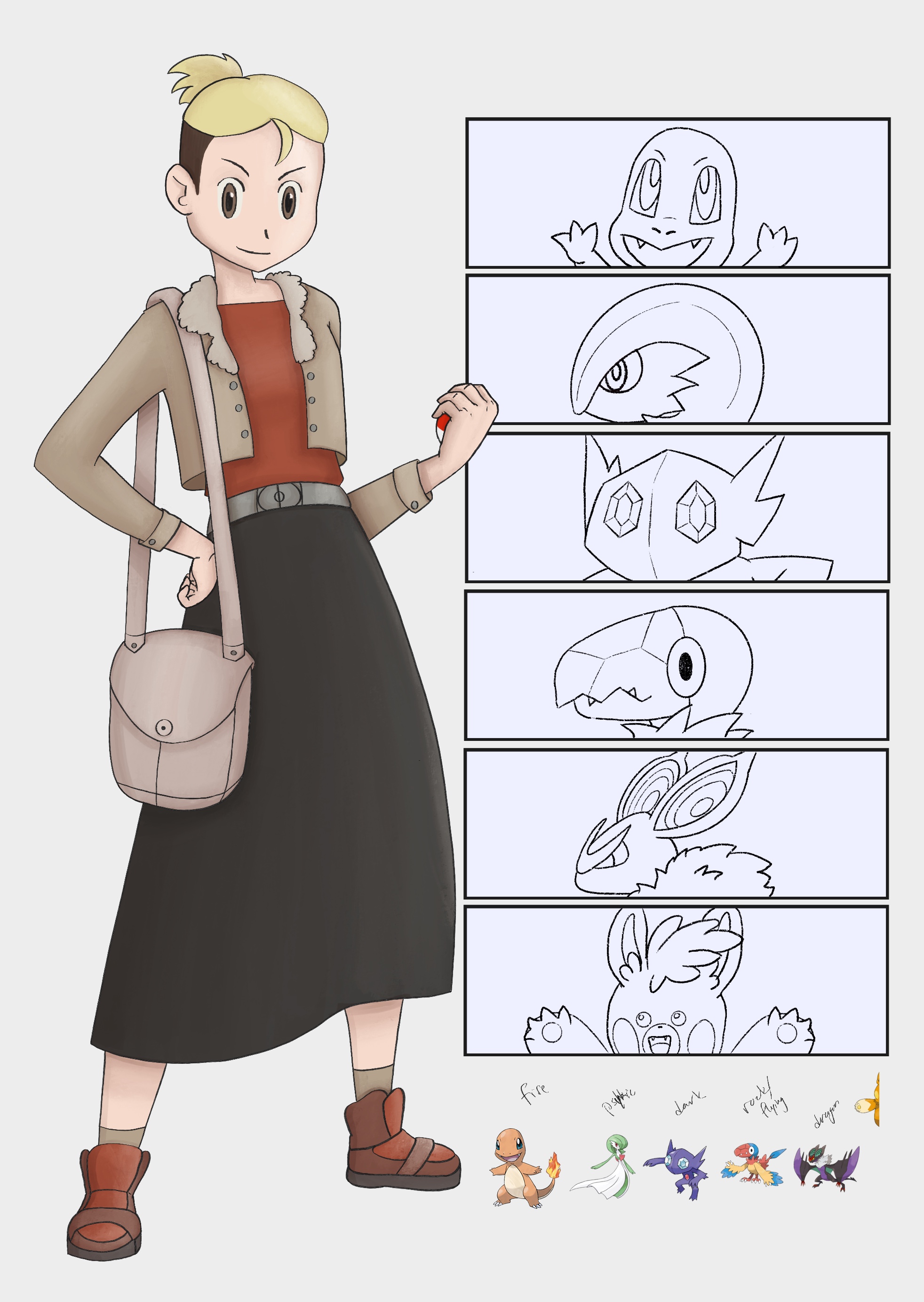
The shading is rather hard in Pokemon art, with some harsh lines. While the light is rather… light. I think what a lot of people learned was that you should be resisting the smudge tool and trying to keep those hard lines. I however, did not resist the smudge tool and ended up smudging most of my shadows as I didn’t like how hard they looked. I even did multiple shadow passes to add some harder lines back in after. I think this has led to way too much texture in the image which the original style doesn’t really have.
Step 5 - Adding a team
There are a lot of cute original trainer art pieces out on the internet. I copied their format of including your Pokemon team next to the trainer art. I didn’t want to spend a lot of time on the Pokemon so I just did quick sketch + lines and colour picked from the sprites to fill them in, then a touch of minimal shading.
Conclusion
The most in-depth and helpful video on learning this style was Mastering The Pokemon Art style! - Master Study by IMTHEJOHKE. He does an intense 3 day style study in a format that I’d like to try out in the future. He talks about his experimentation to get the right look and also about his research. And it was funny to see him reference another style study video which happened to be the one I had watched just before, Subjectively’s How to Draw in the Pokemon Style.
Subjectively’s video was more focused on the Pokemon of Pokemon games but he shared the brushes he used in Procreate. Since the line and colouring style of Pokemon art is so unique this was a game changer for everyone in the comments.
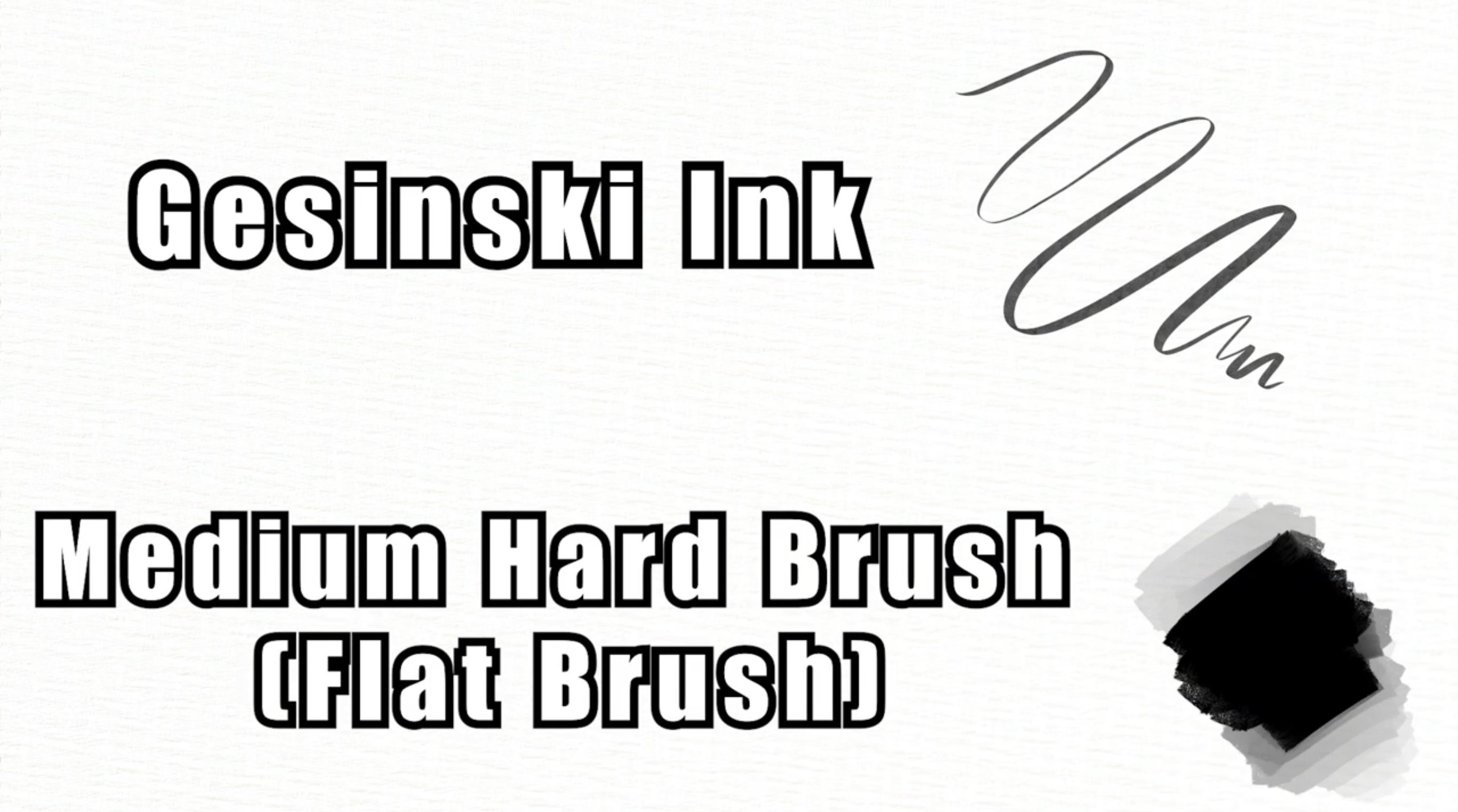
This is a screenshot from IMTHEJOHKE's video.
So while IMTHEJOHKE and Subjectively were really able to break down some of the larger pieces of the Pokemon style and how to replicate it digitally, I found Rjamez Valdez’s video series to be key to really making trainers. He seems to publish 1 video a year and has promised another one so I guess I’ll be waiting for that one to drop some day.
I haven’t done a style study like this before and it was really fun to go from idea to research to execution. It wouldn’t have been so easy if there wasn’t already people who had done the hard work and condensed their discovery into YouTube videos, so a challenge to myself will be to do a style study on my own instead of just second hand. But those are projects I hope to take into next year!
Pinterest board of Pokemon trainers.
