Style Study - Hades
Second style study of the year is the art of Hades, the hit Supergiant game and one of my all time faves.
My approach to this week was to re-create some existing game assets and then adapt one of my characters into a Hades styled portrait shot. A slightly different approach from my Root week as I found this style much more difficult and just mentally draining because of how central the line art is to the style.
Main focuses for the week:
- Line art style
- Colours
- Ink black shadows
Research
I knew this would be a pretty easy art style to research because Hades is so beloved. So there are multiple videos of people breaking down the style, people sharing their research, others compiling a list of inspiration and techniques used from multiple interviews with the art director.
Which is an amazing amount of resources to learn from, but because this is an official in-house style used by multiple artists, there aren’t really first hand reports from them. Which I think makes sense because while the style is going to be replicated, you don’t need to make it super easy for people to make knock-offs.
There is however one very short sequence in episode 3 of the the Developing Hell documentary that shows the layers coming together on Jen Zee’s screen.
Style inspiration
While I did 5 years of art in highschool, I never really learned much about… art styles. Our teacher touched on a few classical artists but there was a big push to focus on Canadian content so the only artists I know are like The Group of Seven.
Because of that it makes learning about professional artist inspirations all the more beneficial. These are some of the names that came up when Jen Zee talk’s about the inspiration for Hades’s look:
- Mike Mignola (Specifically inspired the direction of the Hades art)
- Yoji Shinkawa (For his strongly sculpted character art)
- Fred Taylor (For his use of colour and setting)
Then there were a few art techniques and inspirations that have also been identified by artists or mentioned by the team. And have been put into a huge list in this Point n’ Click blog post. Covering things like classic Greek statues, the importance of diversity, pottery art, and the myths themselves.
As someone who spends a lot of time looking at reference images, and now this year trying to do more studies, it’s cool to see someone else’s clear lines that link what an artist is currently doing to what has come before.
Breakdowns
I think I’ve shared this video before but it’s easily one of my favourite approaches to style studies; Breaking Down the Hades Art Style. Thom catches a lot of details and does a really cool basic sphere to show off the important style features.
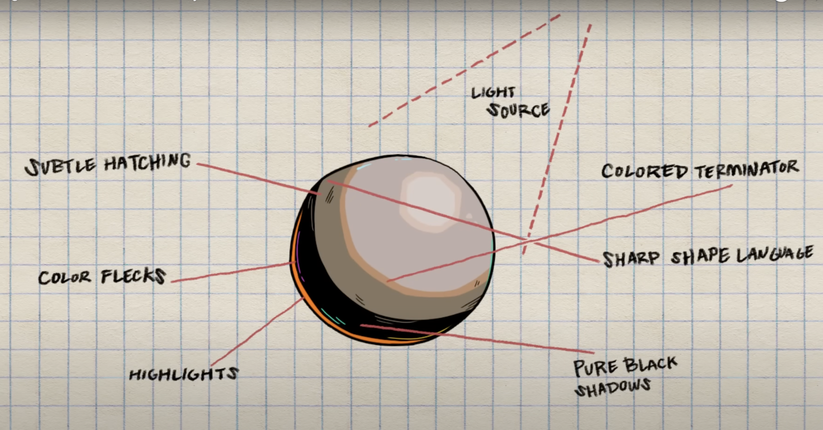
Another interesting breakdown is Dayron Desmet’ study to create a style bible where he goes over multiple different facets of the style before designing his own 3 accessories in the game style.
Style warm-ups
I started with recreating a few smaller art assets from Hades. No full character portraits, except for Dusa who is probably the smallest portrait in the game.
I chopped these birds off of Artemis’s bow because I love them but also hardly noticed them before since they’re so far away from the rest of her body. I suspect they’re cropped out in most scenes when she’s on the screen.
I struggled with these guys a lot. I felt like I wasn’t getting the shapes down. I hated the way the line art looked. I had no wait in the fixed sized brush. Sunday and Monday were mostly try > delete > restart. Then I finally mentally gave myself permission to not try to match the shapes as accurately and really turned up stabilisation on the brush settings.
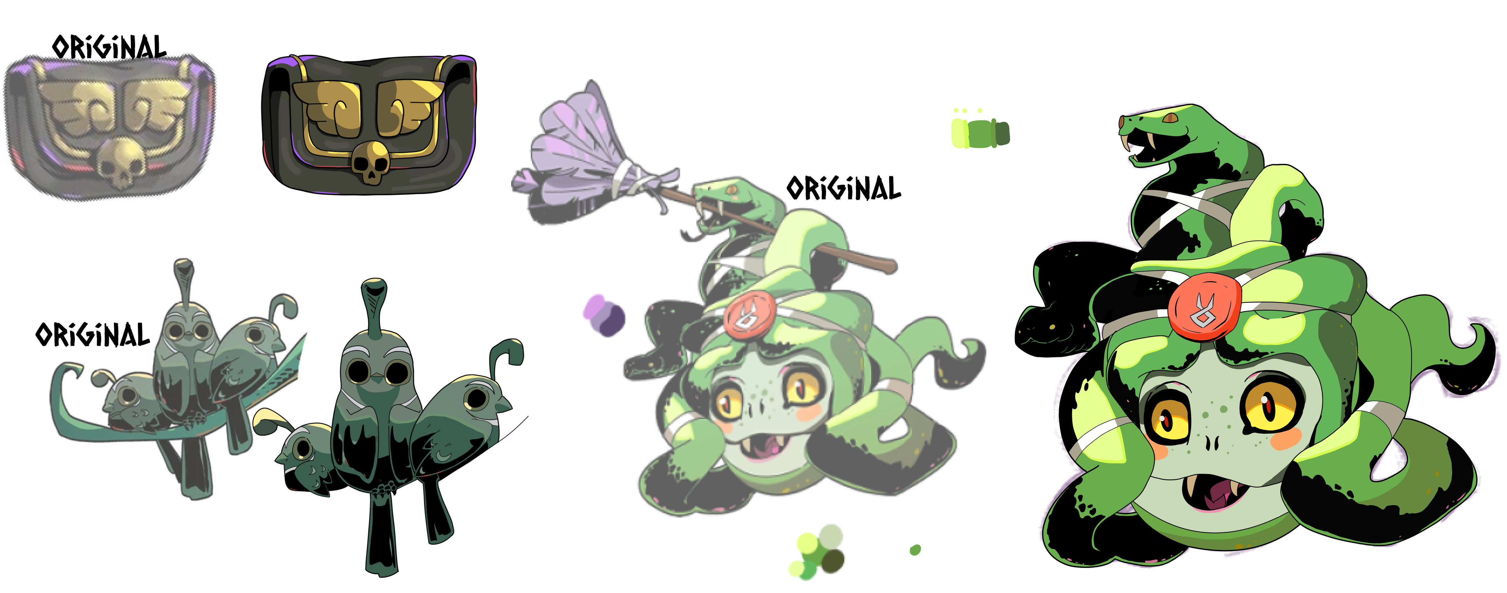
The wallet came out okay but my drop of focus on the shape made for some uneven edges but I enjoyed the gold bits.
Dusa was more of a struggle, just being more complex than the previous two practice pieces. But I really wanted to draw the snakes so I stuck with this one even with her slightly off-tilt face.
Brush
It was during these practices that I was able to figure out the right brush because the line work is another part of the distinguished style. It's main feature being a lack of tapering and consistent width.
Thom, in his render breakdown video name dropped the brush he used but I don't have that one. I ended up using a Clip Studio default: The Milli pen.
This marker has no tapering, a locked size, and no pressure sensitivity turned on. So to work with smaller or larger lines I would manually change the size. Keeping my range from 7-4. 7 being used only for the external lines and then going down a number for each time I felt like I was going more "interior" to the piece.

Final piece
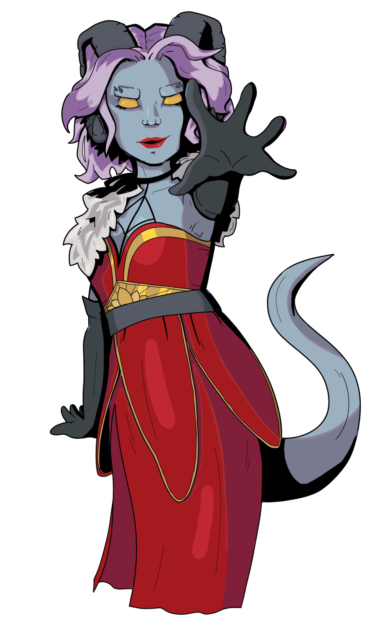
I had already made up my mind to use Skril as my Hades adaptation character, I have a few outfits for her, so I wouldn't have to start from zero design wise. What I did need was a pose.
I tried sketching out a few options and then decided the hand forward pose was the right amount of drama. Used this as my reference.
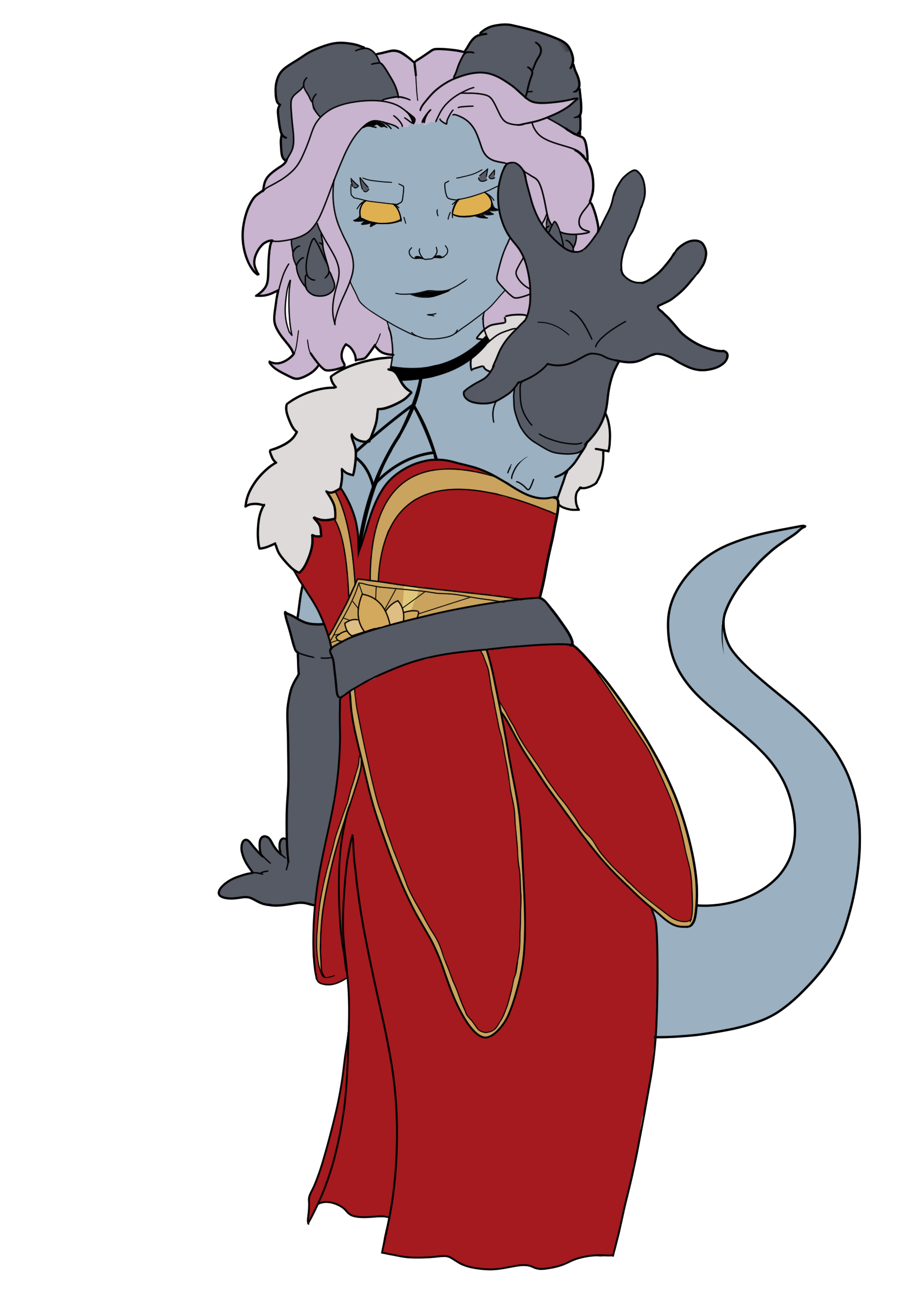
Following the workflow from the Style Breakdown video I started with the lines. I now had more confidence in the process and also the look of the lines compared to my earlier practices. One change up I did go for was to not do the hard black shadows in the first pass. Sticking to only the functional lines.
I then moved on to flats which was a study in itself. Due to an old laptop dying I didn’t have easy access to a Skril reference and instead colour picked them from a photograph of a marker piece from 5 years ago. This ended up being decently accurate.
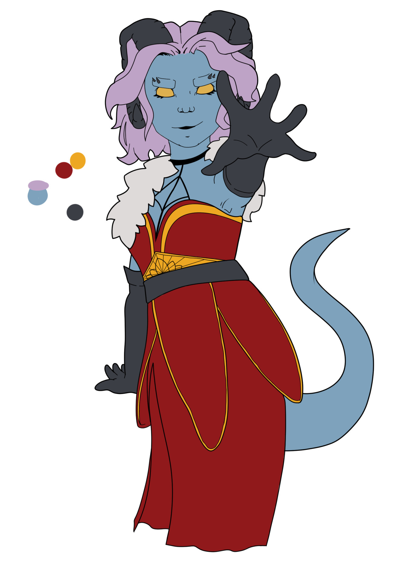
But I had a problem, Hades portraits are colour balanced very carefully.
Colour breakdown
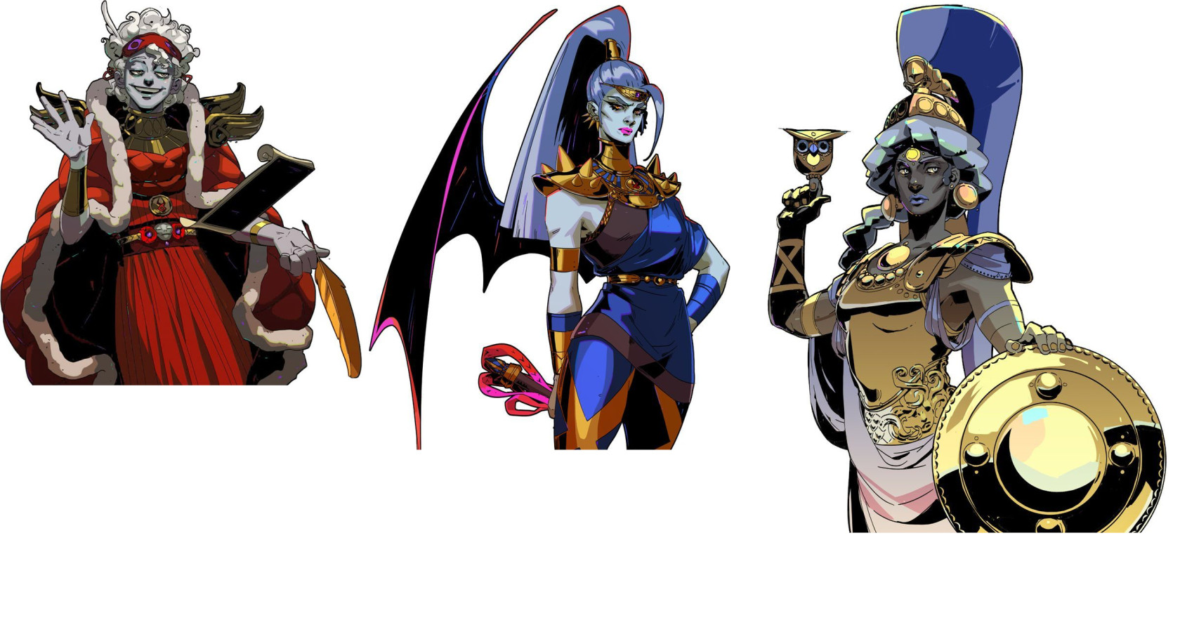 From reading and watching other people break down the style it became clear that I shouldn’t have too many different saturated colours. Characters usually have one main focus colour, often their outfit, while the other large swatches of colour are more de-saturated.
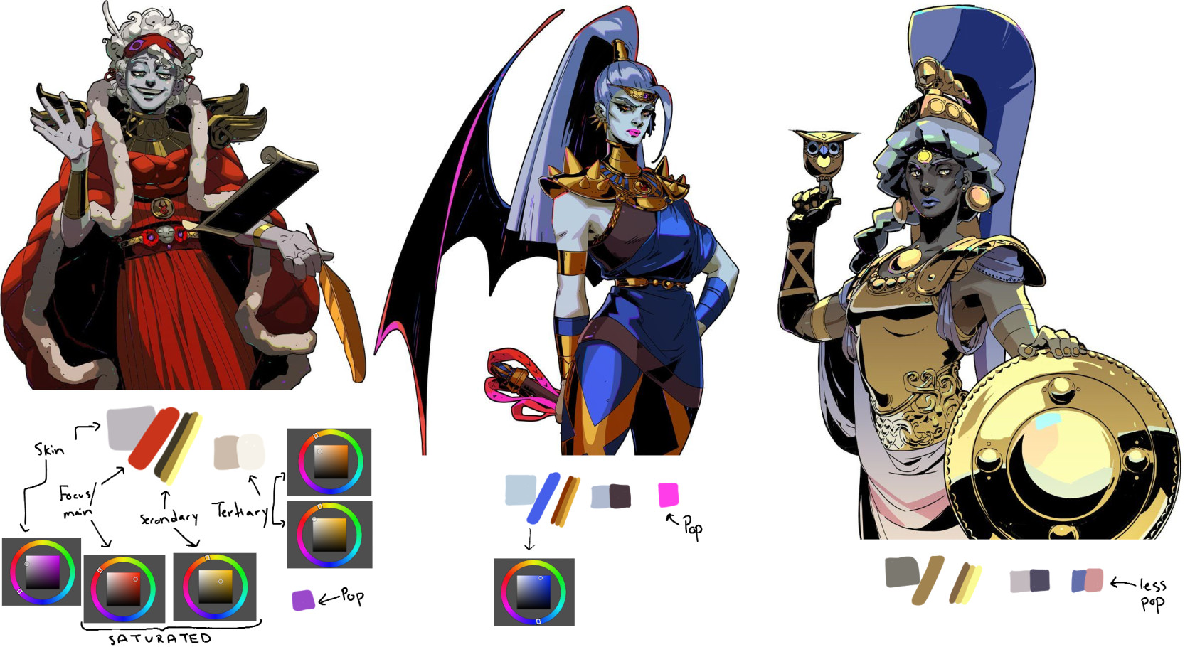
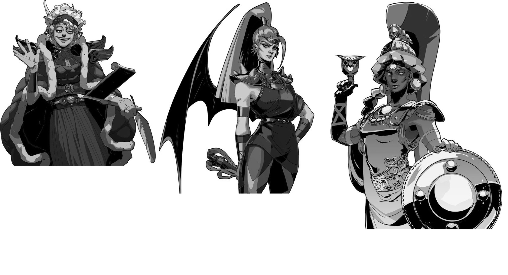
I also checked the values but these didn’t say much to me. If anything it only highlighted that the colour balance does a lot of work to make the characters easily readable without having any very high values (Less white and less high contrast zones than I would have thought). Or maybe the sheer amount of pure black was throwing off my evaluation.
With this knowledge I changed up Skril’s skin, horn, and hair colour. Leaving just the saturated reds and golds. As the red fell into a similar zone as the prime colours for Hypnos and Meg:

With the colours changed I spent some time choosing the shadow and terminator line colour for my main colours. The terminator line colour is one of the unique calling card features of the Hades style. The terminator line is the line of colour around the darker shadow colour. Usually it would just be a colour between the base and the shadow but in this style it’s usually a colour between the two but also decently hue shifted.
With lines, flats, and shading done, it was time to start adding the black shadows. I don’t know if it was good to leave this part for last. If only because I ended up covering multiple areas I spent time shading…
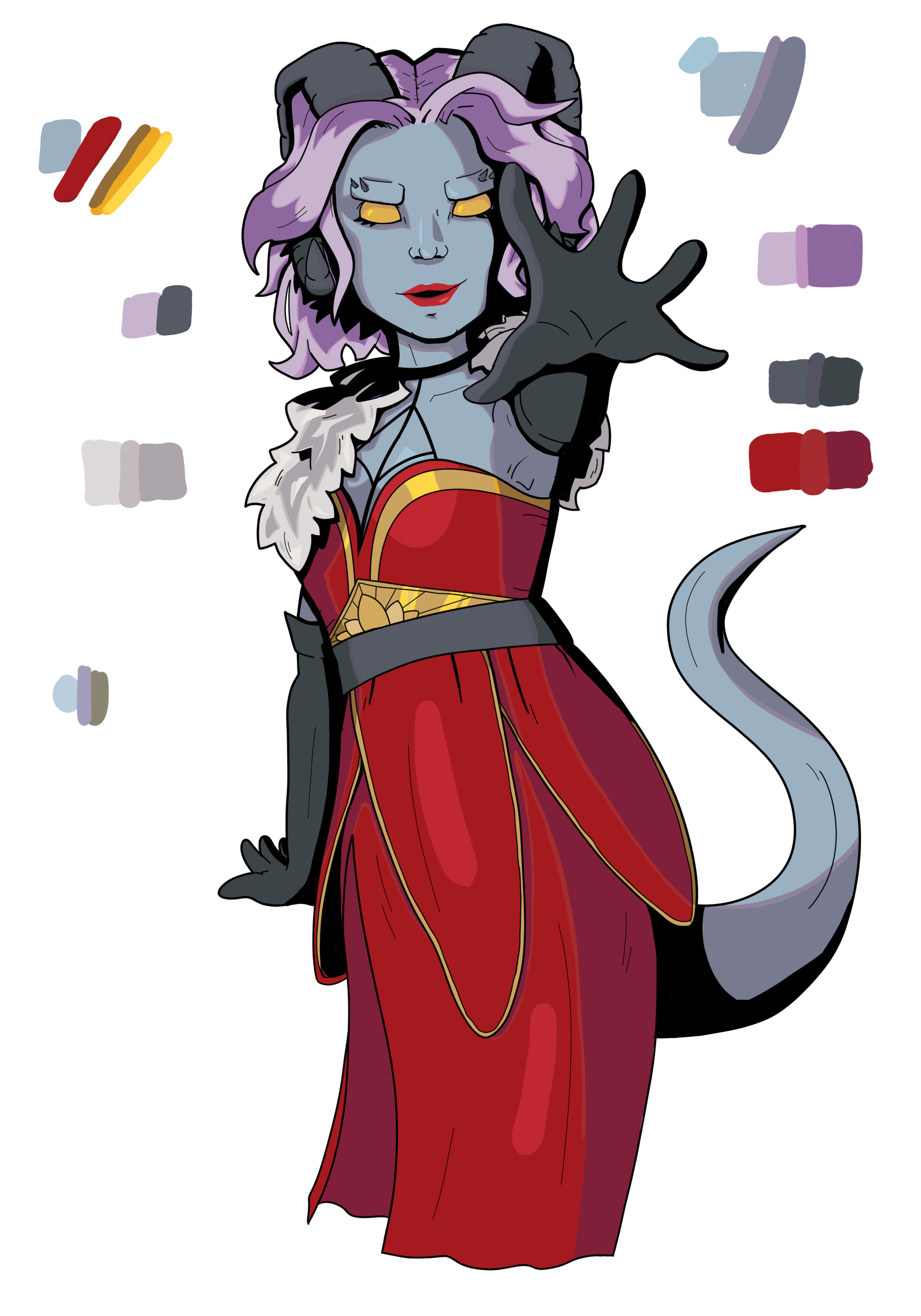
I’m still not sure if there should be more black. General art advice is to not use pure whites or pure blacks so it still feels extreme to me to have those big black areas.
With the piece nearly done, it was time for random sparkles.
This is another unique feature of the style that people have noticed. All art pieces have what appear to be random specks of teal, purple, pink, and a few other colours. I couldn’t find any evidence of these colours being applied in a specific way so I kind of just put them around randomly.
What I missed
There are a few places where I deviated from the official style.
Firstly is in my smooth lines. In Hades art you'll almost never find a perfect circle, even perfect curves are rare. But I was drawing a curvy lady so I drew curvy lines. I also hadn't been able to build up line confidence in my warm-ups and I was relying a lot of brush stabalization to get lines I was happy with. Downside being that those almost come out too perfect.
Another issue, building on those curved lines was my lack of squares. A lot of Hades art has points and hard curves, also called 'Sharp Shape Language' in Thom's breakdown. If you look at characters fingers you'll see they have square tips. This was a bit because of the lines and a bit because I forgot. Line work is what I struggle with so it takes up a lot of my attention. So while I'm focused on just trying to get lines I like I forgot there were other rules to be following.
For colours I feel like I maybe didn't use enough? The official art has an almost busy feeling to it when you look closely. There is a lot going on. While I left some rather large basic red zones in my pieces. I probably could have tried a few ways of making it more lively.
Oh and I didn't draw legs. I thought the image would crop higher up for the fake screenshot so I hadn't bothered to give them lines and then by the end of it I didn't want to go back and add them back in lol.
“In-game” screenshot
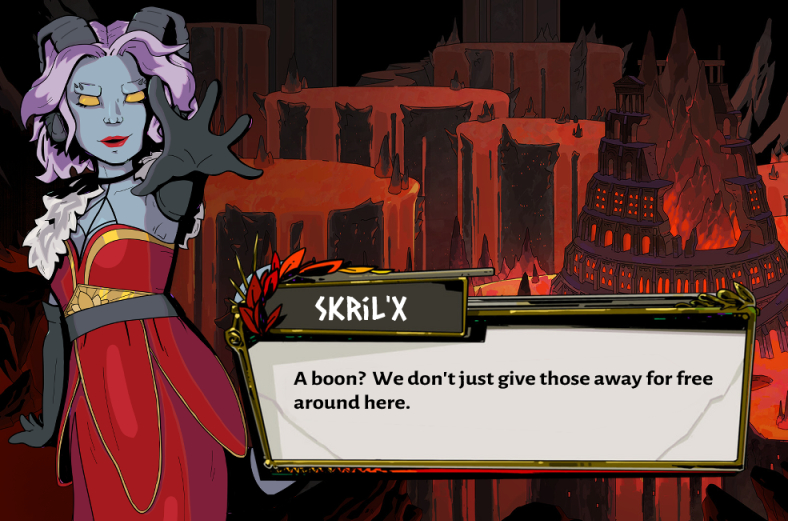
Making fake Hades screenshots is a pretty popular artist project so finding all the pieces needed was very easy. But in case anyone ever comes looking here they are in one place.
Text box
I suspect a few people have done this themselves already, but TheeMonkeyPrince’s version comes up first in a search result. There’s some clear pixelation issues found in the shape they used to hide text from the screenshot they used but that’s easy to fix with a little blur.
Fonts
I didn’t have these ready to go when I started the text box but as I suspected someone had done the research long ago. Even named which font is used for what in this helpful StackExchange comment.

I’ve become very fond of the font for character names which is titled Caesar Dressing.
Background
For the background, I grabbed Joanne Tran’s official work from her ArtStation page where she’s shared a lot of Hades art.
Conclusion
I have given myself a stretch goal of creating a more Underdark themed background to use in my fake screenshot since that's where Skril's from. Just not sure when I'll have time to squeeze in an extra background.
This study took a few days longer than I normally allow. Fell on a D&D week and I lose my creative window on D&D days to D&D prep. And then I felt under the weather on Sunday so that was my main art days gone. So instead of my planned WAP week I'm going to spend this week getting familiar with some tools.
I upgraded to Clip Studio v4 last week so I'm excited to try out some of it's new features. And I want to learn the new features in the ToonSquid v2 release that happened a few months ago. So maybe I'll try and get back into some animation stuff this week.
